Lab 10: Usability Heuristic Evaluation
Learning Objectives
- Understand what a heuristic evaluation is and why it's useful
- Apply Nielsen's 10 Usability Heuristics to evaluate a real software system
- Identify specific usability problems and connect them to heuristic violations
- Communicate usability findings clearly in a written report
What Is Usability?
Usability is a measure of how well a software system supports humans in achieving their goals. It's not a single property — it's a collection of related qualities:
- Learnability: Can users figure out how to use it the first time?
- Effectiveness: Can they successfully complete their intended tasks?
- Productivity: Once they know the system, how efficiently can they work?
- Retainability: If they come back after time away, do they remember how to use it?
- Satisfiability: Do they actually enjoy the experience?
These five aspects often trade off against each other. A dense, information-packed interface might boost productivity for experts but tank learnability for newcomers. A guided tutorial helps new users learn but frustrates experienced ones. Good usability design means making these trade-offs intentionally — for specific users, doing specific tasks, in specific contexts.
Overview
In this lab, you'll conduct a heuristic evaluation — a structured inspection where you examine a real interface against established usability principles. Unlike user testing (where you observe real users completing tasks), a heuristic evaluation is done by reviewers who systematically check whether the interface follows best practices. It's fast, doesn't require recruiting participants, and can be done at any stage of development.
Research shows that 3–5 evaluators using heuristic evaluation can identify roughly 75% of usability problems in an interface. It's one of the most cost-effective usability methods available — and a skill you can apply immediately in your own projects.
Part 1: Heuristics and Examples (15 min)
This part is TA-led. Present the heuristics and walk through the examples below before students form groups. The goal is to make sure everyone understands what a heuristic violation looks like and can ask questions before they start evaluating on their own.
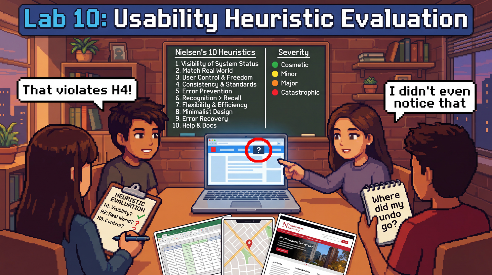
Nielsen's 10 Usability Heuristics
These were developed by Jakob Nielsen in the 1990s, and they remain the most widely used framework for heuristic evaluation. They work because they're based on how humans think — not on any particular technology.
| # | Heuristic | Ask yourself... |
|---|---|---|
| H1 | Visibility of System Status | Does the system keep me informed about what's happening? (Progress bars, loading indicators, confirmation messages) |
| H2 | Match Between System and Real World | Does it use language I understand, or developer jargon? Do things appear in a natural order? |
| H3 | User Control and Freedom | Can I undo mistakes? Is there a clear way to go back or cancel? |
| H4 | Consistency and Standards | Does the same action work the same way everywhere? Does it follow platform conventions? |
| H5 | Error Prevention | Does the design prevent me from making errors in the first place? (Grayed-out invalid options, confirmation dialogs) |
| H6 | Recognition Over Recall | Can I see my options, or do I have to remember things? Is current state visible? |
| H7 | Flexibility and Efficiency of Use | Are there shortcuts for experienced users? Can I work efficiently once I know the system? |
| H8 | Aesthetic and Minimalist Design | Is the interface cluttered? Does every visible element earn its place? |
| H9 | Help Users Recognize, Diagnose, and Recover from Errors | When something goes wrong, does the error message explain what happened and what I can do? |
| H10 | Help and Documentation | Is help available where and when I need it? Is it task-focused? |
A single usability problem can violate multiple heuristics — that's fine. If a confusing error message violates both H9 (error recovery) and H2 (match real world), note both.
Examples of each heuristic
Walk through one concrete example for each heuristic so students can calibrate what a "violation" looks like. Spend about a minute on each — show or describe the example, name the heuristic, and briefly explain why it's a violation. Feel free to substitute your own examples.
| # | Heuristic | Example |
|---|---|---|
| H1 | Visibility of System Status | Slack: When you send a message, it immediately appears in the chat with a subtle timestamp — you know it went through. Violation: An online form that shows a blank screen after you click "Submit" with no confirmation. |
| H2 | Match Between System and Real World | Violation: An error message that says NullPointerException at line 247 instead of "We couldn't find your account — try logging in again." Users aren't developers. |
| H3 | User Control and Freedom | Gmail: If you accidentally delete an email, a "Undo" toast appears for several seconds. Violation: A checkout flow with no back button — you can't change your shipping address without starting over. |
| H4 | Consistency and Standards | Violation: A website where some buttons are blue and some are green, but both do the same thing (submit). Or a mobile app where swiping left deletes in one screen but archives in another. |
| H5 | Error Prevention | Google Calendar: When you schedule a meeting at 2 AM, it asks "Did you mean 2 PM?" Violation: A form that lets you type your birthday as February 30th and only tells you it's wrong after you submit. |
| H6 | Recognition Over Recall | Violation: A command-line tool that requires you to memorize exact flag names with no --help option. Compare: an IDE's autocomplete dropdown that shows you available methods as you type. |
| H7 | Flexibility and Efficiency of Use | Google Docs: Novices use the toolbar to bold text; experts hit Ctrl+B. Both work. Violation: An app that forces you through a 5-step wizard every single time, even for a task you do daily. |
| H8 | Aesthetic and Minimalist Design | Violation: A settings page that shows 50 options at once when most users only need 3. Compare: iPhone Settings, which groups related items and hides advanced options. |
| H9 | Help Users Recognize, Diagnose, and Recover from Errors | Violation: A file upload that fails with "Error 500." Better: "Your file is too large (52 MB). The maximum size is 25 MB. Try compressing it or uploading a smaller file." |
| H10 | Help and Documentation | Violation: A "Help" link that takes you to a 200-page PDF manual. Better: contextual tooltips that appear next to the feature you're using (e.g., a "?" icon next to a confusing setting). |
After walking through the examples, take questions. Then have students form groups of 3–4 and choose their evaluation target.
Part 2: Form Groups and Choose Your Target (5 min)
Form groups of 3–4 students. As a group, pick one of the following applications to evaluate:
| Application | Why it's interesting |
|---|---|
| Microsoft Excel or Google Sheets | Enormously complex feature set, used by novices and power users alike — rich territory for flexibility/efficiency and learnability trade-offs |
| Google Maps | Multi-modal (driving, transit, walking, cycling), used under time pressure, heavy mobile use — great for error prevention, system status, and real-world matching |
| Northeastern Khoury College website | You're the target audience — you can evaluate from genuine experience, not hypotheticals |
Pick something your group members actually use (or have tried to use). Real frustrations make better evaluations than hypothetical ones.
Once you've chosen, open REFLECTION.md in your lab repository and fill in Section 1 (your evaluation target and group members' names).
Create your personas
A persona is a fictional but realistic description of a specific user — their background, goals, technical comfort level, and the context in which they use the application. Personas help you evaluate from a perspective other than your own, which is critical because you are not the only user.
Each group member should create a different persona to evaluate from. Your persona should be someone who would plausibly use your chosen application but has a different experience than you. Give them a name and a brief description. For example:
Marcus, 62, retired teacher. Just got a smartphone last year. Wants to use Google Maps to find bus routes to visit his grandchildren. Types slowly, doesn't know what "pinch to zoom" means, gets flustered by pop-ups.
Priya, 28, data analyst. Lives in Excel 8 hours a day. Uses keyboard shortcuts for everything. Gets frustrated when she has to reach for the mouse. Knows the product deeply but has no patience for inefficiency.
James, 20, freshman CS student. Just transferred to Northeastern. Needs to find course requirements on the Khoury website but doesn't know Northeastern-specific jargon like "co-op" or "NUpath." Only uses his phone — doesn't own a laptop.
Make sure your group covers a range of perspectives — vary technical experience, familiarity with the app, context of use (mobile vs. desktop, time pressure, etc.).
Record your persona in Section 1 of your REFLECTION.md, alongside your name.
Part 3: Individual Evaluation (15 min)
Each group member evaluates the application independently, considering all 10 heuristics — but through the lens of your persona, not yourself.
As you use the application, stay in character. Ask: would my persona understand this? Would they be able to recover from this error? Would they find this shortcut?
Go through each heuristic and look for violations. Jot down each issue you find, noting:
- Which heuristic it violates (H1–H10)
- What functionality/screen you were looking at
- What the violation is — be specific
- Why your persona would struggle — connect it to their background, goals, or context
Be specific. "The interface is confusing" is not a usability finding. "On the directions page, switching from driving to transit clears my destination and I have to re-enter it" is.
Regroup with your team. Go around and briefly introduce your persona and share what you found. Did different personas lead to different issues? Between everyone, are you hitting 6+ issues across 4+ heuristics?
Part 4: Consolidate and Write Up (15 min)
Back in your group of 3–4, share all the issues you each found individually. Pay attention to how your different personas shaped what you noticed — an issue that's catastrophic for one persona might be invisible to another. Discuss which ones are the strongest, resolve any disagreements about severity, and compile the best ones into Section 2 of your REFLECTION.md.
Your goal: at least 6 usability issues reflecting at least 4 different heuristics.
For each issue, use this format:
### Issue [number]: [Brief title]

**Heuristic:** H[number] — [Heuristic Name]
**Functionality/Screen:** [What part of the application]
**Violation:** [Specific description of the usability problem]
**Who is affected:** [Which persona(s) would struggle with this, and why?]
**Severity:** [Cosmetic / Minor / Major / Catastrophic]
**Suggested fix:** [What would you change?]
- Cosmetic: Noticed only by careful evaluation; fix if time allows
- Minor: Causes minor delays or confusion; users can work around it
- Major: Causes significant difficulty; some users may fail at the task
- Catastrophic: Prevents users from completing their task; must be fixed
Then complete Section 3: Reflection together:
- Which heuristic was the easiest to evaluate for your chosen application, and why?
- Which heuristic was the hardest to evaluate, and why?
- How did your persona influence what you noticed? Describe at least one issue that you found because of your persona that you probably would have missed evaluating as yourself.
- Did different personas lead to different severity ratings for the same issue? Give an example.
- Think about a project you've built (an assignment, a personal project, anything). What's one usability heuristic it probably violates — and for which users?
Is your REFLECTION.md complete? Make sure you have at least 6 issues across at least 4 heuristics, and that each issue has all six fields filled in. Pick the 1–2 most interesting issues to share with the class.
Part 5: Class Debrief (15 min)
Each group will briefly share 1–2 of their most interesting usability issues with the class. For each issue, tell us:
- What application you evaluated
- What the usability problem is
- Which heuristic it violates
- How severe you rated it
As you listen to other groups, notice:
- Did groups evaluating the same application find different issues?
- Are certain heuristics violated more often across applications? Why might that be?
- Were any issues surprising — things you use every day but never noticed as problems?
Submission
Submit REFLECTION.md through your Pawtograder lab repository.
Grading
Option 1: Complete all sections of REFLECTION.md (evaluation target, 6+ issues across 4+ heuristics, reflection questions) → full credit.
Option 2: Submit whatever you complete along with the reflection questions documenting your progress, what you found challenging, and what you learned → good-faith credit available. Attendance and genuine engagement matter more than perfection.