Stakeholder trade-offs — you can't optimize for everyone
L24 taught us to evaluate usability. Today: how to design for it from the start.
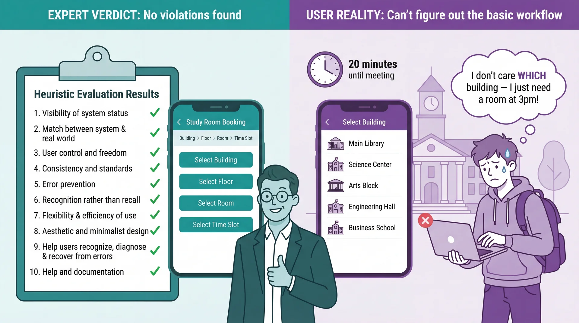
Nielsen's Heuristics: A 30-Year-Old Checklist That Still Works (review)
H1: Visibility of system status
H2: Match between system and real world
H3: User control and freedom
H4: Consistency and standards
H5: Error prevention
H6: Recognition rather than recall
H7: Flexibility and efficiency of use
H8: Aesthetic and minimalist design
H9: Help users recognize, diagnose, and recover from errors
H10: Help and documentation
Developed in the 1990s by Jakob Nielsen, these heuristics capture recurring patterns in usability problems. Their relevance to modern apps (including mobile, IoT, voice interfaces) is a testament to the stability of human cognitive factors.
Why Aren't the Usability Techniques from L24 Sufficient?
Heuristic Evaluation Catches Violations, Not Misunderstandings
Connection to L24: Heuristic evaluation is valuable — but experts evaluating against principles are not the same as real users trying to accomplish real goals. Use both: heuristics catch obvious violations quickly and cheaply; UCD catches deeper mental model mismatches that experts can't see.
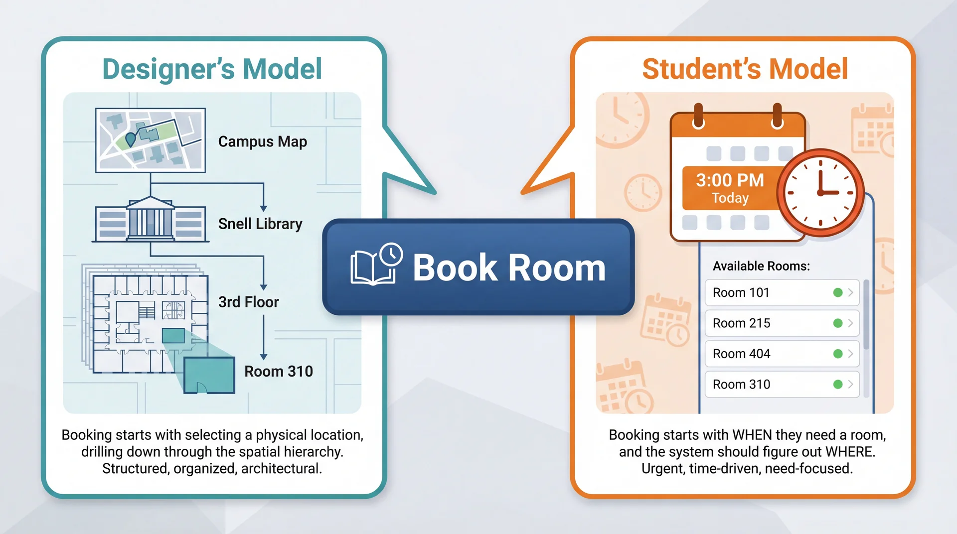
The Designer's Mental Model Is Not the User's Mental Model
Neither model is wrong. But when the interface assumes the designer's model, users who think differently get lost — and no amount of expert review catches this.
Connection to L24: Remember Marcus and Dorothy? Marcus (power user) might think building-first because he understands system architecture. Dorothy (visiting grandparent) thinks time-first — she just wants a room at 3pm. Same gap: expert vs. casual user mental models.
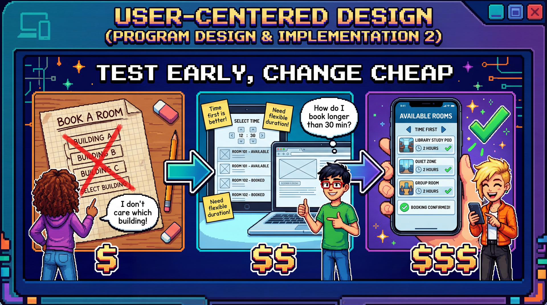
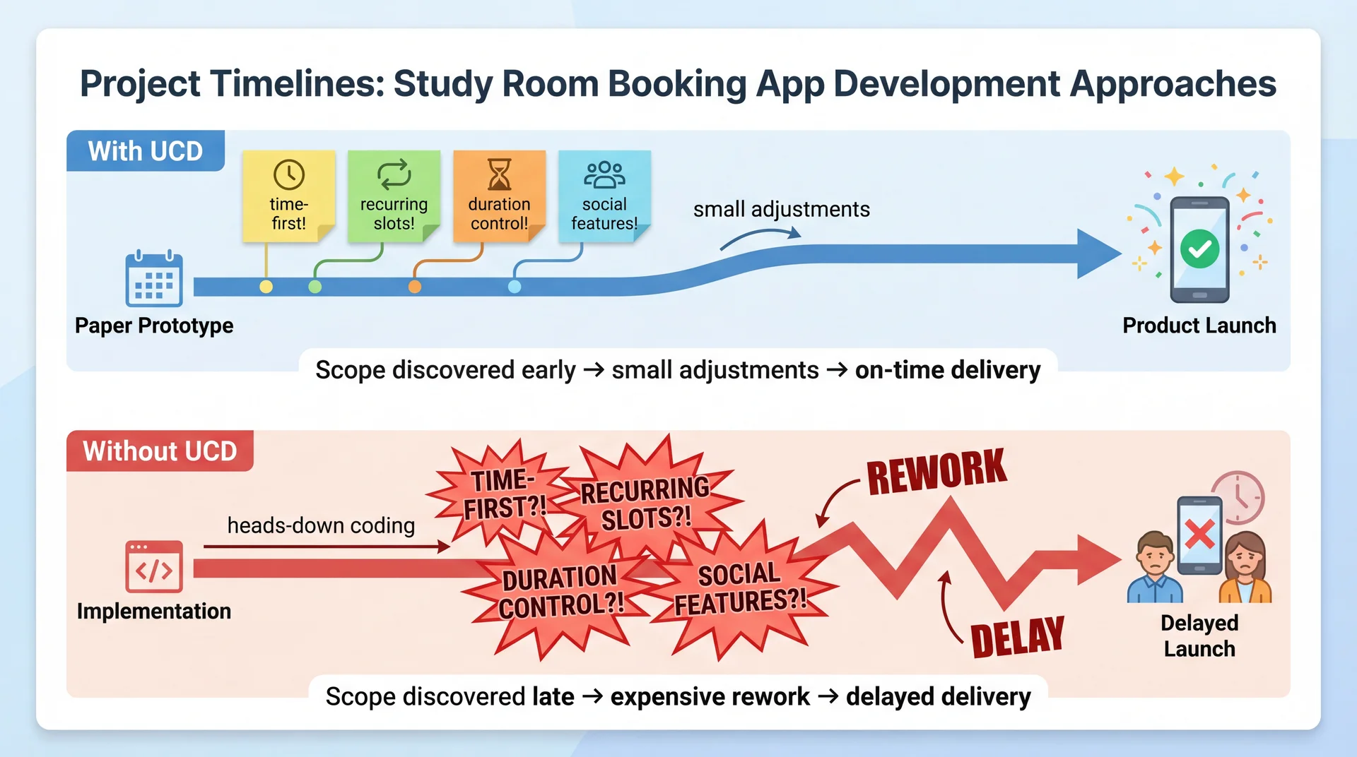
Building the Wrong Thing Is the Most Expensive Mistake in Software
Paper prototype fix: minutes $
Mockup fix: hours $$
Code fix: days $$$
Redesign after shipping: weeks $$$$
Users abandon your product: everything $$$$$
Every team that skipped user feedback and built for 6 months has the same story: "We thought we knew what users wanted."
Designer assumed building-first navigation → Students wanted time-first search
Designer assumed students know which buildings have whiteboards → Students had no idea
Designer assumed "Reserve" was self-explanatory → Students searched for "Book" or "Get a room" (H2 violation: terminology doesn't match user language)
Designer assumed 30-minute fixed slots → Students wanted custom time ranges like "3pm to 4:30pm" (H1 violation: system constraints not visible)
These aren't edge cases. These are the primary workflow. Connection to L24: Experts applying Nielsen's heuristics are still experts — they share the designer's mental model. Heuristic evaluation catches violations; only real users reveal misunderstandings.
Connection to L9: We introduced the participatory approach for requirements. UCD extends it into the entire design and development process.
The Timing Paradox: We Need Feedback Early but Evidence Comes Late
Cost to change:
Low ✓
High ✗
Quality of user evidence:
Low ✗
High ✓
← Early (design phase)Late (production) →
UCD's answer: iterate with prototypes of increasing fidelity — get user feedback when changes are still cheap.
UCD Is an Iterative Cycle, Not a One-Time Consultation
Each iteration increases fidelity — from paper sketches to working software. Users aren't consulted once at the beginning and again at the end. They're involved continuously.
Prototype Fidelity Should Match Your Current Level of Uncertainty
Paper sketchesLow fidelityMinutes to createZero cost to change
Interactive mockupsMedium fidelityHours to createLow cost to change
Working prototypesHigh fidelityDays to createMedium cost to change
Production softwareFull fidelityWeeks/months to createHigh cost to change
High uncertainty? Use low-fidelity prototypes — don't invest in details until the concept is right. Concept validated? Increase fidelity to test interaction details.
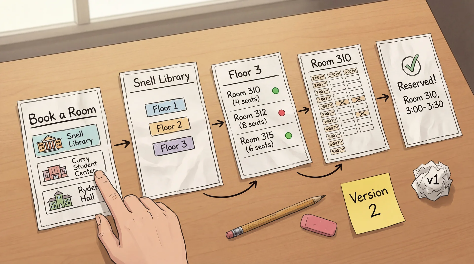
Paper Prototypes: Minutes to Create, Zero Cost to Throw Away
How it works: Draw each screen on paper. A facilitator "plays computer" — when the user "taps" a button, swap in the next paper screen.
Why it works: Users feel comfortable criticizing paper. Fast to modify during the session. Forces focus on concepts, not visual polish.
Paper Prototypes Reveal Conceptual Confusion Before You Write Code
Facilitator(shows paper Screen 1: building list): "You have a group meeting at 3pm today. Book a study room."
Student: "Um... which building should I pick? I don't care which building. Is there a way to just see what's free at 3?"
Facilitator: "What would you expect to see first?"
Student: "A time picker? Or just... a list of rooms that are available at 3. I don't want to check every building one by one."
The entire navigation concept is wrong — discovered in 5 minutes with paper. Not in 5 sprints with code.
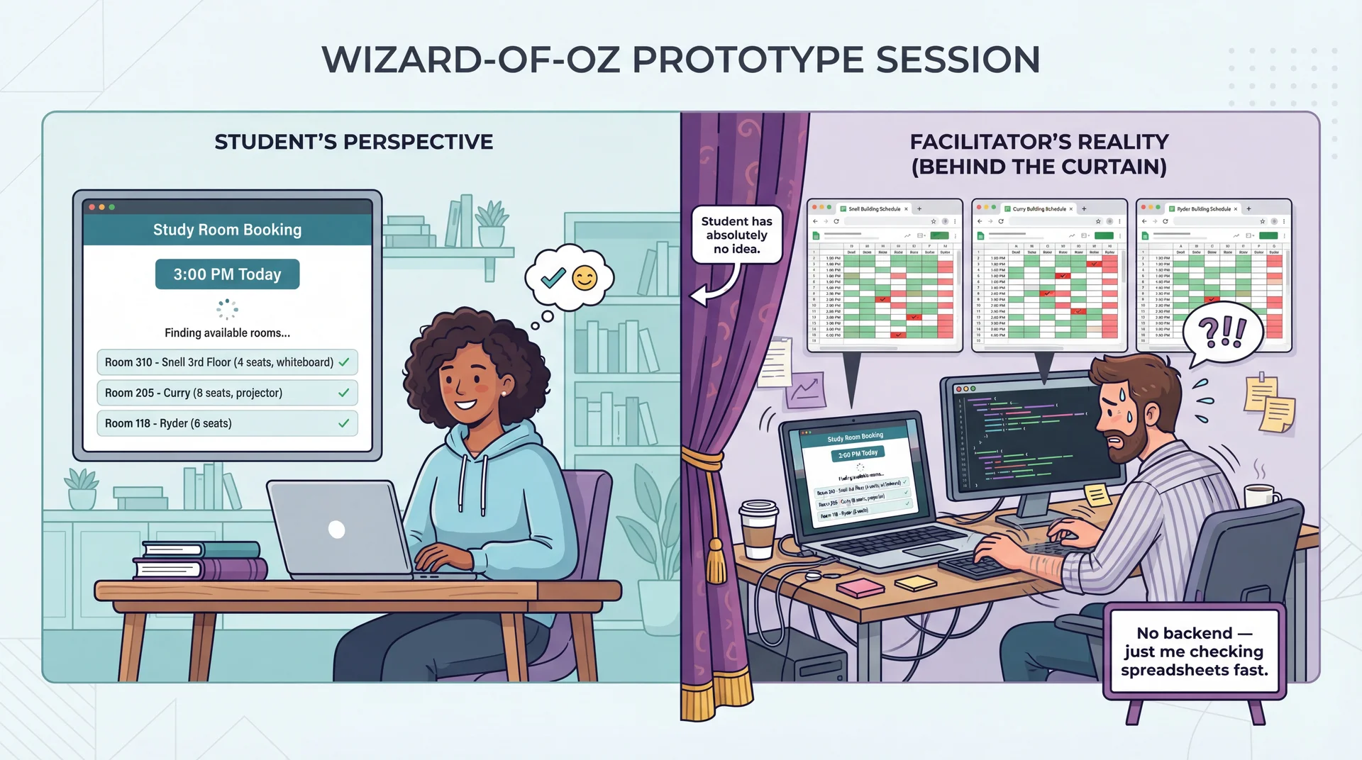
Wizard-of-Oz Prototypes: Real Interface, Human Behind the Curtain
The interface looks real. The responses look real. But a human is simulating the hard parts. Test the user experience before building the technology.
Working Prototypes Reveal What Only Real Interaction Can
Time Picker Feel
Does the time selector feel snappy on mobile?
Can students quickly jump between days?
Paper and mockups can't test this.
Availability Updates
Does the room list update smoothly when the time changes?
Is the loading state clear?
This is about milliseconds and feedback.
Keyboard Navigation
Can students tab through the time picker and room list?
Do screen readers announce availability?
Accessibility requires real code.
How it works: The UI is fully implemented and responsive. But instead of a real availability API, it returns predefined room lists. Instead of a real booking backend, it uses mock data.
The UI is real. The backend can be mocked. Test the interaction, not the infrastructure.
AI Accelerates Prototype Creation, Not User Understanding
What AI can do ✓
Generate UI code quickly: "Create a room booking interface with a time picker and room list"
Create realistic sample data: "Generate 50 study rooms across 5 buildings with capacities and amenities"
Produce design variations: "Show me three different layouts for the available rooms list"
Write Wizard-of-Oz scripts: "Write a server that returns mock room availability data"
What AI cannot do ✗
Replace actual user testing: AI generates prototypes, but can't tell you if students understand them
Know your specific users: AI produces "average" designs — your users (commuters? residents? grad students with lab access?) have specific needs
Predict user confusion: The whole point of UCD is that you can't predict user behavior from first principles
AI builds prototypes in seconds. Only users can tell you if they work.
Your team designs a campus dining app organized by dining hall location. During testing, students say "I just want to know what's open near me that has pizza." What have you discovered?
A. A heuristic violation — the navigation labels are unclear
B. A mental model gap — designers organized by location, users think by food and proximity
C. A bug — the search feature isn't working
D. That students are using the app incorrectly
Text espertus to 22333 if the URL isn't working for you.
Your team validated that time-first booking is the right concept. Now you want to test whether users understand the room capacity labels and can select a duration — but the availability backend doesn't exist yet. What prototyping approach fits?
A. Paper prototype
B. Wizard-of-Oz prototype
C. Working prototype
D. Heuristic evaluation
Text espertus to 22333 if the URL isn't working for you.
You interview 5 students about what they need in a room booking app. They mention search, booking, and a calendar. A paper prototype test with 5 different students reveals they also want recurring bookings, custom durations, and to see where friends booked. Why did the interviews miss these?
A. The interviewees were less knowledgeable than the prototype testers
B. The interview questions were poorly designed
C. Users can't articulate needs they haven't encountered yet — prototypes make abstract needs concrete
D. Interviews are always less reliable than prototypes
Text espertus to 22333 if the URL isn't working for you.
"Wait, it says 3:00 to 3:30? We need at least an hour. How do I change that?" (H1: system status not visible — user didn't know about fixed slots)
The color coding reveals what to listen for: confidence, hesitation, success, problems discovered. Notice how UCD reveals issues that map back to Nielsen's heuristics — but only real users reveal which heuristics matter most.
A 25-minute session: 5 min warmup ("think aloud as you go") → 15 min tasks (3-4 concrete tasks) → 5 min debrief ("what surprised you?"). 3-5 users catches most major problems.
Task Completion Testing: Measure Where Users Succeed and Fail
Study room booking tasks given to 10 test users:
Book a room at 3pm
90%
Find a room with a whiteboard
80%
Book for longer than 30 min
65%
Cancel and rebook a room
30%
Success rate Completed the task?
Time on task How long?
Error rate Wrong paths tried?
Assistance needed Asked for help?
Findings Require Root Cause Analysis, Not Just Symptom Fixing
Finding: "Students can't book for longer than 30 minutes"
Same symptom, three different root causes, three different fixes. Connection to L24: Root causes often map to specific heuristics (H1: visibility, H2: user language) — but UCD reveals which root cause is actually affecting your users.
Move to higher fidelity when major conceptual issues are resolved
Iterate at the same fidelity when you're still finding fundamental problems
Stop when additional testing reveals only minor, diminishing issues
There's no magic number of iterations. The goal is confidence that the concept is right before investing in higher-fidelity work. CS 2484 and 4530 explore this process in much greater depth.
"What features do you need in a room booking app?"
"Search for rooms"
"Book a room"
"See my bookings"
3 basic features described.
Interviews capture what users think to mention.
Prototype testing (UCD)
Watch a student use a paper prototype to book a room.
"I think about time, not building" ← conceptual model
"I need this room every Tuesday" ← recurring booking
"Does '4 seats' mean max?" ← ambiguous labeling
"Can I extend if we run over?" ← edge case
"Can I see where my friends booked?" ← social feature
5+ requirements and conceptual insights discovered.
Prototypes reveal what users actually do.
Interviews discover features. Prototypes discover requirements — including the organizing principles and workflows that make features usable. Connection to L24: Prototypes test all five usability aspects directly — can users learn it, be effective, stay productive?
Users Interacting With Prototypes Reveal Requirements You Never Imagined
UCD isn't just a usability technique — it's a requirements elicitation technique. Real users with real tasks reveal functional requirements, edge cases, and workflow mismatches that no requirements document would capture.
After a prototype session, document what you learned:
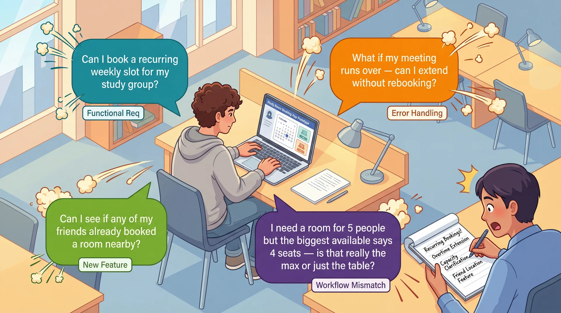
User said: "We need this room every Tuesday" → Requirement: Recurring weekly booking (Functional)
User did: Ignored building list, looked for time picker → Requirement: Time-first navigation as default (Conceptual model)
User asked: "Does '4 seats' mean max?" → Requirement: Capacity must distinguish comfortable vs. maximum (Labeling)
User struggled: Couldn't extend past 30 min → Requirement: Custom duration input, not fixed slots (Workflow mismatch)
Every observation has a source (what the user said/did), a requirement (what the system needs), and a type (functional, conceptual, labeling, workflow). This is how UCD produces requirements, not just usability feedback.
UCD Reduces All Three Dimensions of Requirements Risk
Understanding Risk ↓
Instead of interpreting requirements documents, you watch users interpret your interface.
Having a representative set of users test your prototype directly reduces this risk.
Scope Risk ↓
Prototyping reveals hidden complexity. The "simple" room booking turns out to need recurring slots, duration control, capacity clarification, and social features.
Better to discover this expansion during paper prototyping than during implementation.
Volatility Risk ↓
Early user feedback lets you pivot before committing.
If prototype testing reveals students fundamentally misunderstand your booking workflow, you can redesign the concept before building it.
Connection to L9: Same three risk dimensions we identified in requirements analysis — now with a concrete mitigation strategy at every stage of development.
Better to Discover Hidden Scope on Paper Than in Production
"Our Feature" concept — your original idea (designed, not built)
Due Thursday March 26. Full spec: GA0: Design Sprint. Assign features, then start sketching.
Key Takeaways: UCD Creates a Continuous Feedback Loop Between Users and Implementation
Expert evaluation has limits — heuristic evaluation catches violations, but only real users reveal the gap between your mental model and theirs
Building the wrong thing is the most expensive mistake — 2 hours of paper prototyping can save weeks of rework
Iterate with increasing fidelity — paper → mockups → working prototypes, testing with users at each stage. Move up when the concept is validated.
Prototypes reveal what interviews miss — interviews discover features; prototypes discover requirements, mental models, and workflows
Document findings as requirements — every observation has a source (what the user said/did), a requirement (what the system needs), and a type (functional, conceptual, labeling, workflow)
UCD reduces understanding, scope, and volatility risk (L9) — by making requirements visible through user behavior, not documents