CS 3100: Program Design and Implementation II
Lecture 24: Usability
©2026 Jonathan Bell, CC-BY-SA
Learning Objectives
After this lecture, you will be able to:
- Define usability and describe the five key aspects of usability
- Identify stakeholders and their usability concerns
- Create personas to make design trade-offs explicit
- Recognize the relationship between usability and safety
- Apply Nielsen's 10 Usability Heuristics to evaluate an interface
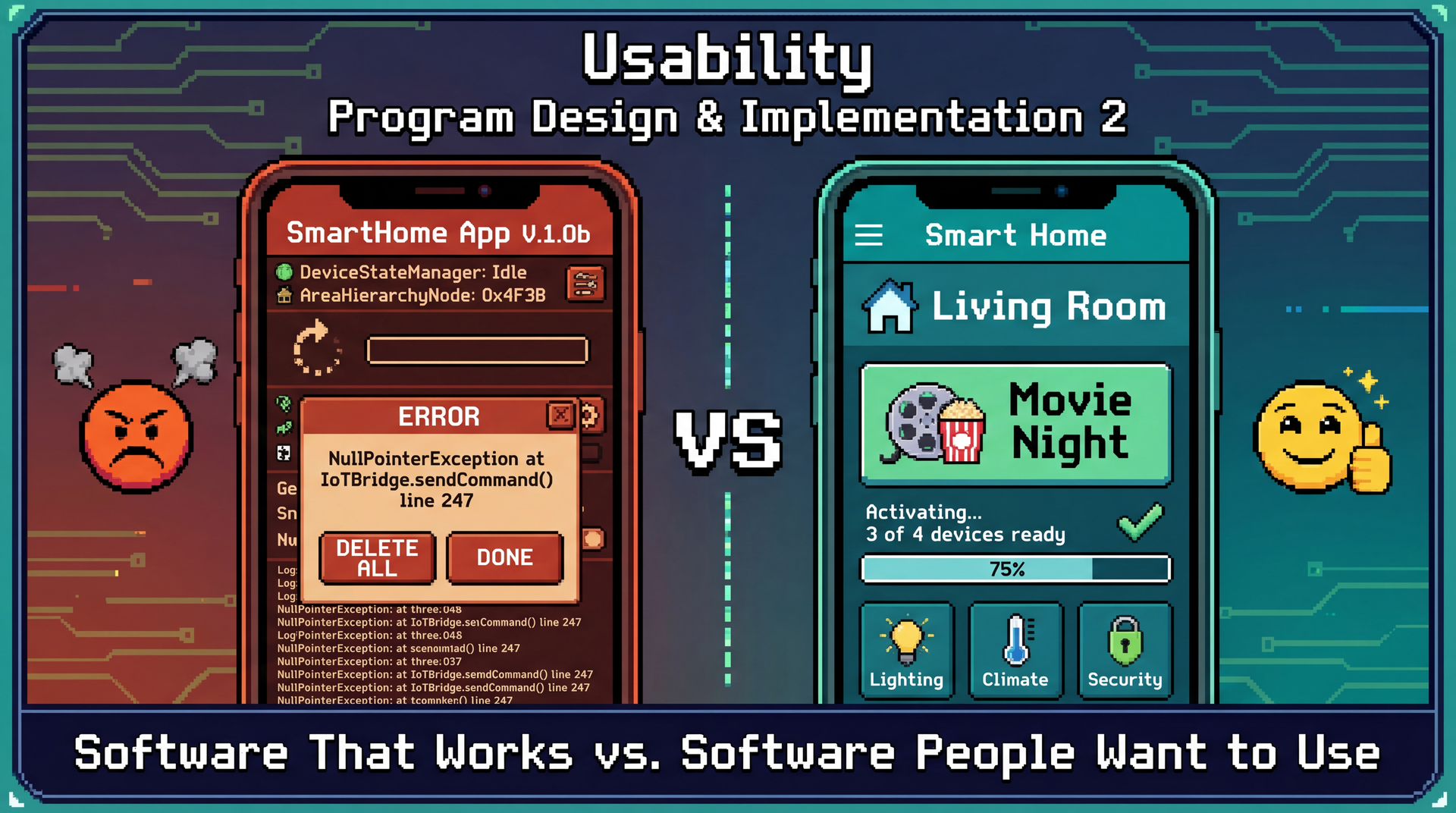
Working Software Is Table Stakes — Usable Software Wins Users
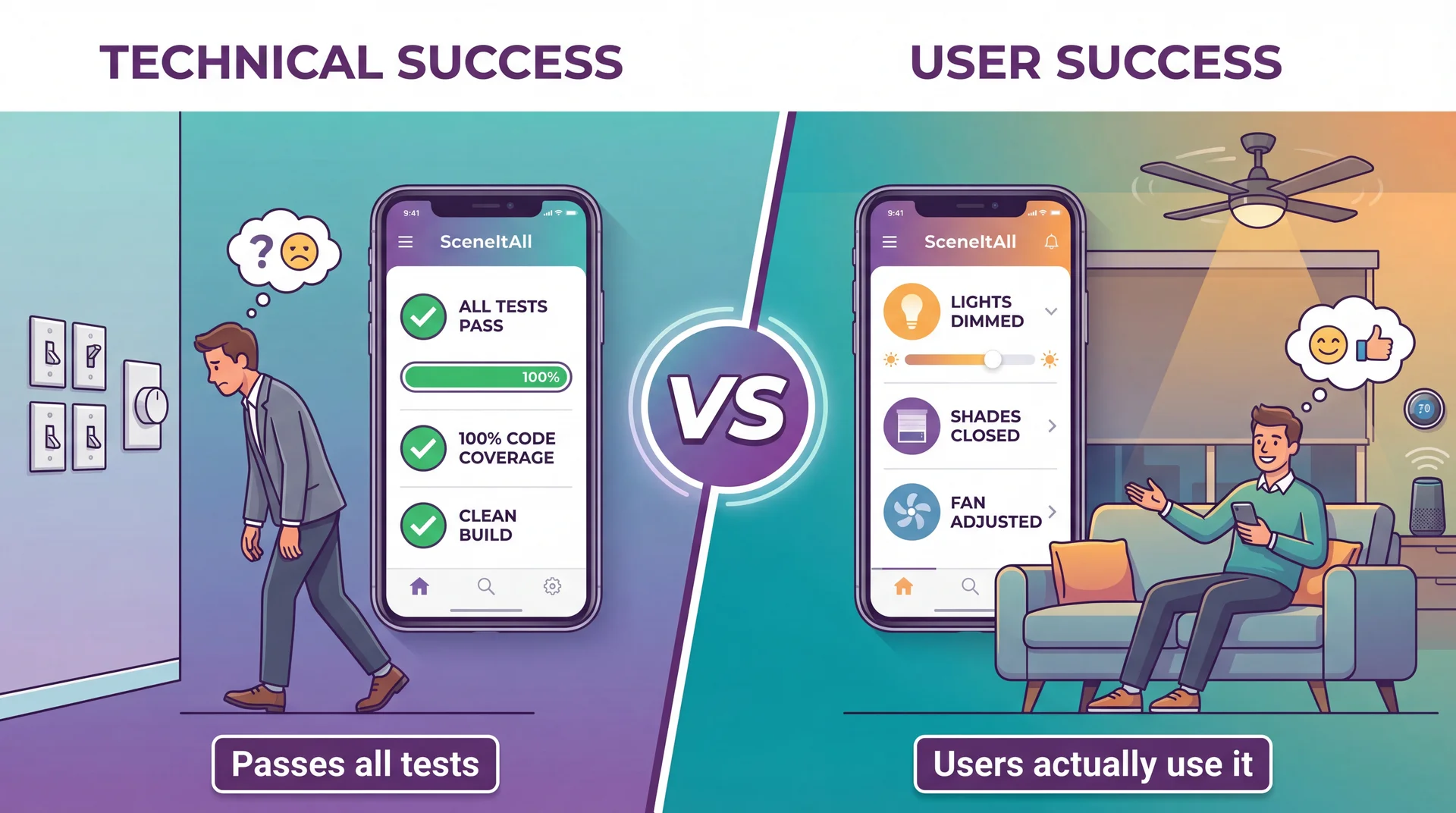
Usability Measures How Well Software Serves Humans Achieving Their Goals
Usability is a measure of how well an artifact (software, device, interface) supports humans in achieving their goals.
It's not a single property but rather a collection of related qualities:
- Can users figure out how to use it?
- Can they accomplish their actual tasks?
- How much effort does it take?
- Will they remember how to use it later?
- Do they enjoy the experience?
Connection to L9: We identified stakeholders and their needs. Usability asks: can they actually meet those needs using our software?
Learnability and Effectiveness: Can Users Figure It Out and Succeed?
Learnability ●
How easy is it for users to accomplish tasks the first time?
SceneItAll test: Can a new user turn off living room lights without a tutorial?
- ✓ High: See "Living Room" → tap → adjust
- ✗ Low: See "Area Hierarchy Browser" → confused
Effectiveness ●
Can users successfully complete their intended tasks?
SceneItAll test: Can users create a "Movie Night" scene?
- Working ≠ Discoverable
- Attempted ≠ Completed
- Completed ≠ Correct
Relationship: Users must first learn the interface before they can be effective. First impressions matter — users who fail early may never try again.
Productivity and Retainability: Efficiency Over Time
Productivity ●
How efficiently can users accomplish tasks once learned?
SceneItAll test: Turn off all downstairs lights
- Low: 12+ taps through nested menus (2 min)
- High: One "Downstairs Off" button (3 sec)
Same outcome, vastly different effort.
Retainability ●
How well do users maintain proficiency over time?
SceneItAll test: Guest returns next holiday — can they still use it?
- Seasonal features (holiday lights yearly)
- Rare operations (adding new device)
- Occasional users shouldn't re-learn
Relationships: Effectiveness leads to productivity through practice. Learnability enables retainability — interfaces matching mental models are easier to remember. Retainability feeds back into productivity.
Satisfiability Connects Everything: The Complete Picture
Satisfiability ●
How pleasant is the experience?
- Satisfied users explore more features
- Satisfied users forgive occasional issues
- Frustrated users abandon for alternatives
The feedback loop: Satisfaction → willingness to learn more → deeper effectiveness → greater productivity → more satisfaction
| Design Decision | Helps | Hurts |
|---|---|---|
| Detailed onboarding tutorial | Learnability | Satisfiability (impatient users) |
| Voice command shortcuts | Productivity | Learnability (more to discover) |
| All options on one screen | Productivity | Learnability (overwhelming) |
You can't maximize everything — good design requires knowing which aspects matter most for your users.
CLI vs. GUI: Neither Is Universal — Context Determines the Right Choice
Command-Line Interface
> sceneitall set living-room lights 50%
Living room lights set to 50%
> sceneitall activate "Movie Night"
Activating scene: Movie Night...
| Aspect | Rating |
|---|---|
| Learnability | Low (must learn commands) |
| Effectiveness | High (if you know commands) |
| Productivity | Very high (for experts) |
| Retainability | Low (forget syntax) |
| Satisfiability | Varies (some love CLIs) |
Graphical Interface
Visual room layout with sliders, buttons, and scene cards
| Aspect | Rating |
|---|---|
| Learnability | High (visual, explorable) |
| Effectiveness | High (guided interactions) |
| Productivity | Medium (more clicks) |
| Retainability | High (visual cues) |
| Satisfiability | Generally higher |
Neither is "better" — it depends on who's using it and for what.
Different Stakeholders Prioritize Usability Aspects Differently
Remember from L9: stakeholders are anyone who affects or is affected by the system. Different stakeholders care about different usability aspects.
| Stakeholder | Usage Pattern | Usability Priorities |
|---|---|---|
| Primary owner | Daily, 10+ times | Productivity, Satisfiability |
| Family members | Daily, didn't choose system | Learnability, Effectiveness |
| Guests | Occasional (holidays) | Learnability, Retainability |
| Installer | One-time configuration | Effectiveness, Productivity |
| Neighbors | Indirect (affected by outdoor lights) | Safety implications |
Same system, same features — but you can't optimize for everyone. You must make intentional choices about priorities.
Personas Make Stakeholders Concrete: Meet Marcus and Dorothy
Persona: A fictional but realistic user that makes trade-off discussions concrete — "Would Marcus find this useful? Would Dorothy be confused?"
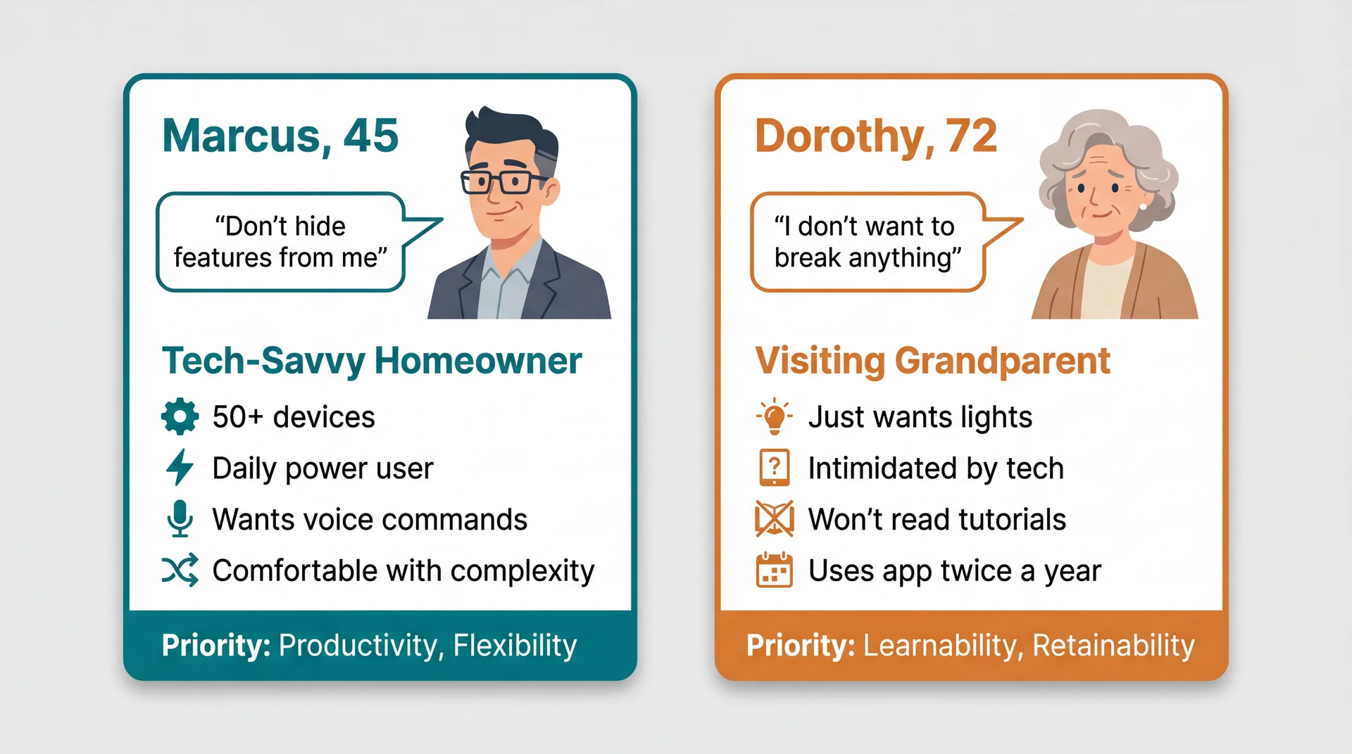
Features Marcus loves (automations, shortcuts) overwhelm Dorothy. Simplicity Dorothy needs frustrates Marcus.
Personas Reveal Which Trade-offs Matter
| Design Decision | Marcus | Dorothy |
|---|---|---|
| Add onboarding tutorial | Skip it (wastes time) | Needs it (can't figure out otherwise) |
| Expose automation rules | Essential feature | Hidden complexity (confusing) |
| Voice command shortcuts | Daily use, loves them | Confusing ("what do I say?") |
| Simple big buttons | "Childish, wastes space" | Accessible, easy to tap |
| Nested area hierarchy | Powerful organization | "Where is the guest room??" |
You can't optimize for everyone. Personas force you to choose primary users and make intentional trade-offs.
Connection to L9: Remember stakeholder analysis? Personas are the usability-focused refinement of that work.
Design Flexibility Can Serve Multiple Personas
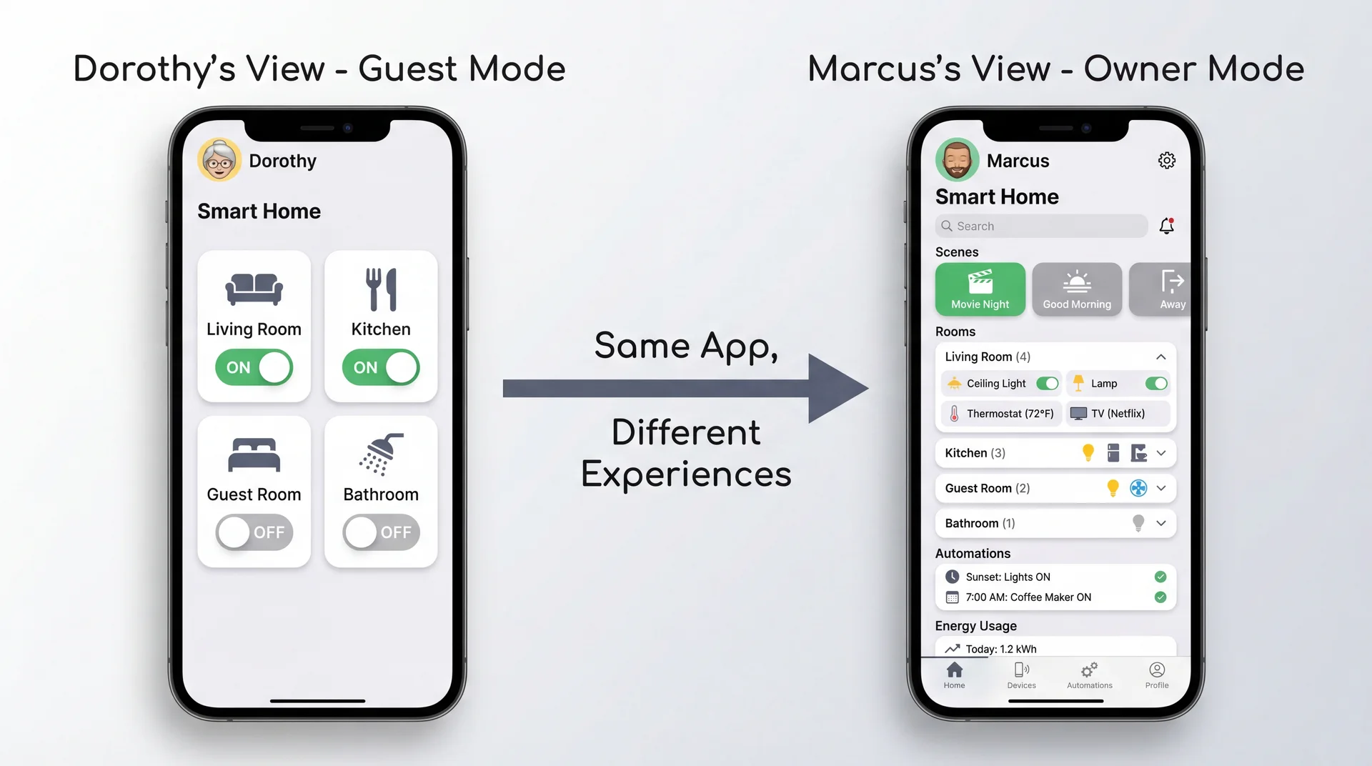
Good design often means designing multiple experiences within one product.
Marcus and Dorothy Have Different Mental Models
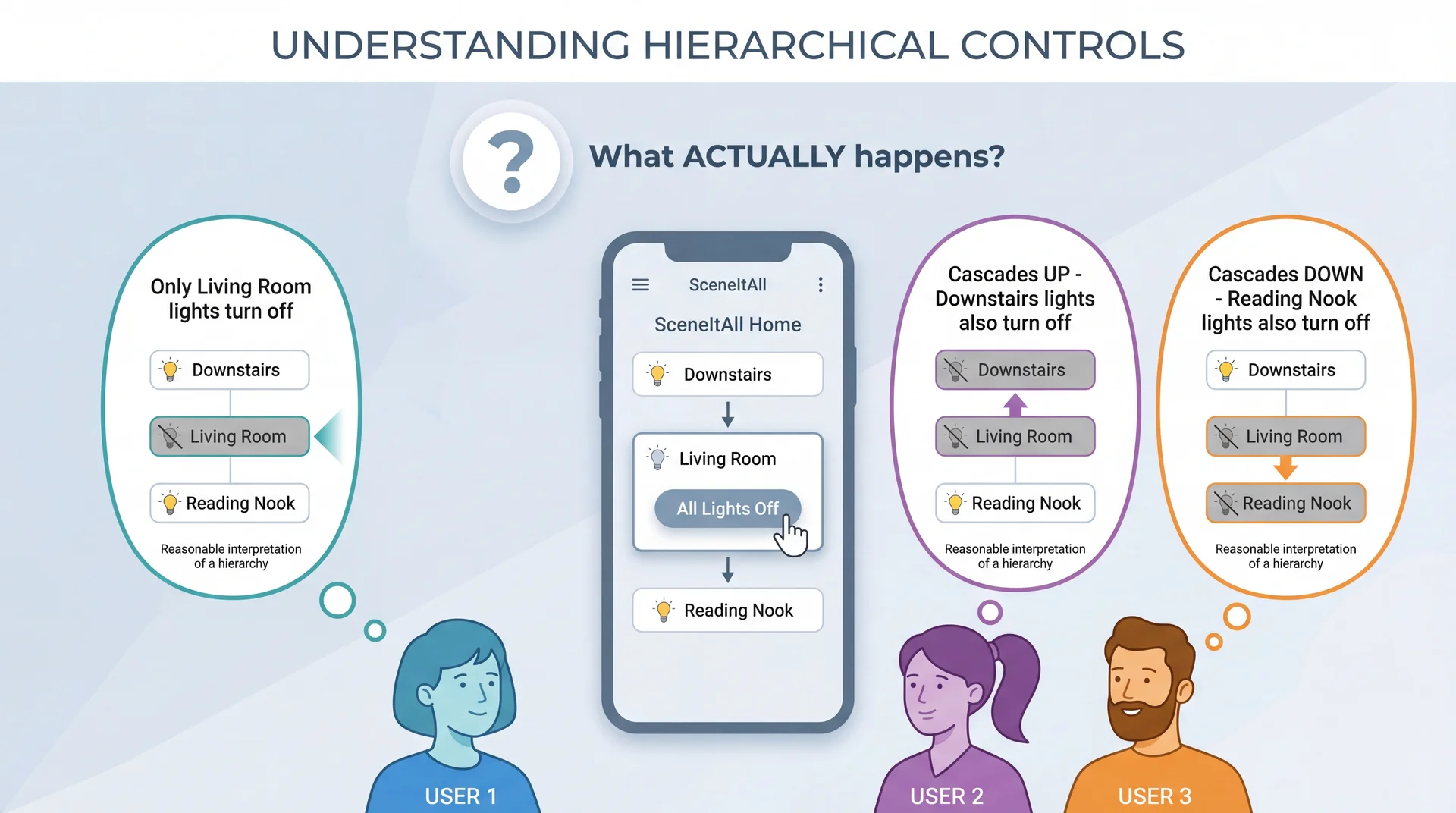
Whatever SceneItAll actually does, it violates someone's mental model.
Good Design Either Matches Mental Models or Makes Behavior Visible
Strategy 1: Match the most common mental model
- Research which expectation is most prevalent
- Design behavior to match that expectation
- Accept some users will need to adjust
Strategy 2: Make actual behavior clearly visible
- Show cascade indicators: "This will affect 3 other areas"
- Preview affected devices before confirming
- Use animations that reveal what's happening
Strategy 3: Both
- Choose sensible defaults that match common expectations
- AND provide clear feedback about what's happening
When you can't match expectations, at least don't surprise users silently.
Usability Failures Create Real Safety Risks
Safety isn't just physical:
| Category | SceneItAll Example |
|---|---|
| Physical | Stairway lights off while someone's on stairs |
| Security | Outdoor lights "always off" creates vulnerability |
| Privacy | Guest can see all family schedules |
| Financial | Accidental bulk purchase of smart bulbs |
| Operational | Disabling smoke detector integration |
Many "usability" issues are actually safety requirements:
- "Confirm before locking all doors" — enhancement or safety?
- "Show who is home before Away mode" — convenience or preventing lockout?
- "Re-authenticate to share access" — friction or security?
⚠ Ask: "What could go wrong if a user misunderstands?"
Forward reference: We'll return to safety-critical systems in L35 (Safety and Reliability).
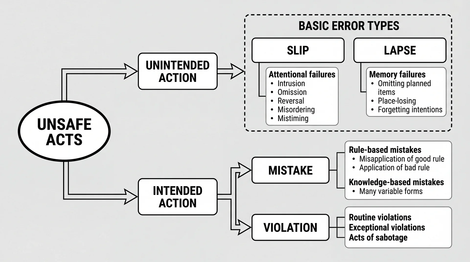
Human Error Has a Taxonomy: Reason's Classification
The Usability Evaluation Dilemma: Best Evidence Comes Late
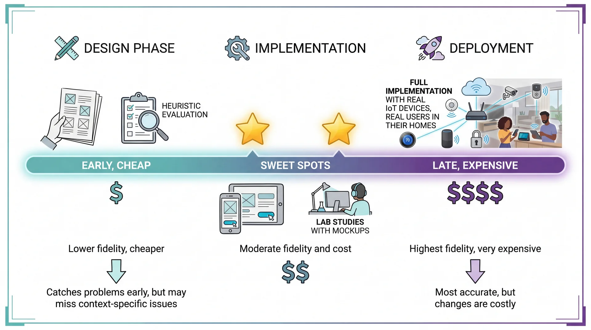
Three Approaches to Usability Evaluation
User Studies
Watch real users accomplish tasks
✓ Gold standard — direct evidence
✗ Expensive, time-consuming
Surveys & Feedback
App reviews, in-app feedback
✓ Large samples, real context
✗ Self-reported, no observation
Heuristic Evaluation
Experts check against principles
✓ Fast, cheap, works on prototypes
✗ May miss domain-specific issues
Today's focus: Heuristic Evaluation — experts systematically check interface against established principles. Nielsen found 3-5 evaluators catch ~75% of usability problems.
Nielsen's 10 Usability Heuristics: a 30-year-old framework that remains remarkably effective.
Nielsen's Heuristics: A 30-Year-Old Checklist That Still Works
H1: Visibility of system status
H2: Match between system and real world
H3: User control and freedom
H4: Consistency and standards
H5: Error prevention
H6: Recognition rather than recall
H7: Flexibility and efficiency of use
H8: Aesthetic and minimalist design
H9: Help users recognize, diagnose, and recover from errors
H10: Help and documentation
Developed in the 1990s by Jakob Nielsen, these heuristics capture recurring patterns in usability problems. Their relevance to modern apps (including mobile, IoT, voice interfaces) is a testament to the stability of human cognitive factors.
H1: Keep Users Informed About What Is Happening
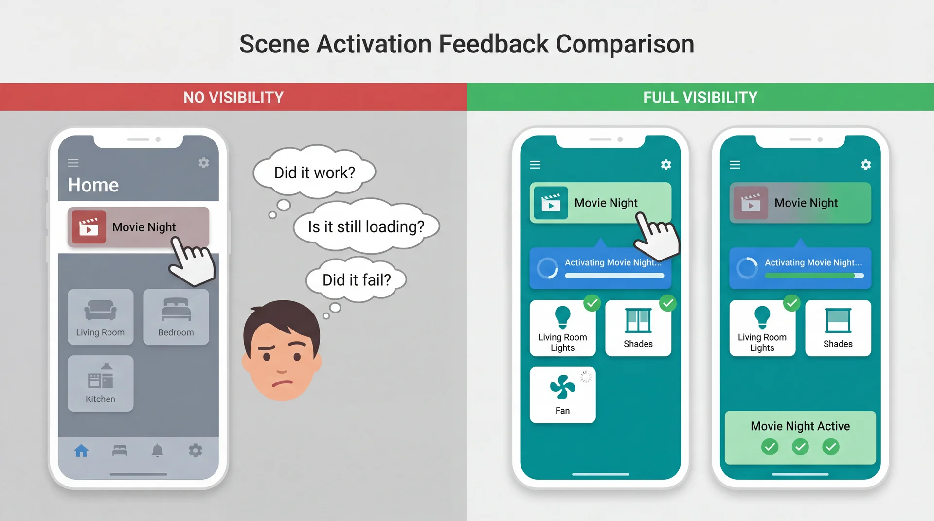
The system should always keep users informed about what is going on, through appropriate feedback within reasonable time.
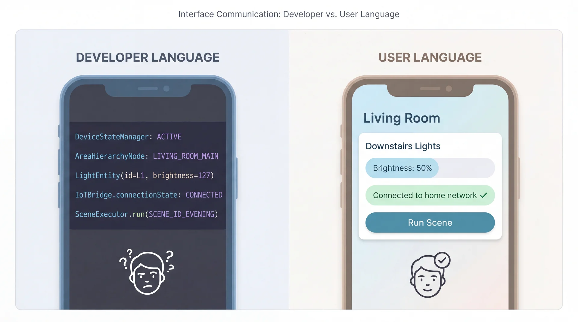
H2: Speak the Users' Language, Not Developer Language
H3: Provide Clear Emergency Exits
Users often choose system functions by mistake and need a clearly marked "emergency exit" to leave the unwanted state.
SceneItAll applications:
- "All Lights On" panic button when a scene goes wrong and everything's dark
- Undo for accidental scene deletions — don't permanently destroy user work
- Cancel during long operations — stop mid-execution if something's wrong
- Easy mode switching — stuck in advanced view? Clear path back to simple mode
Connection to L12: Did our domain model capture "deleted" scenes as recoverable or truly destroyed? This is a design decision with usability implications.
H4: Consistency Builds Trust and Reduces Cognitive Load
Users should not have to wonder whether different words, situations, or actions mean the same thing.
SceneItAll consistency requirements:
- Tapping a device should always show its controls, everywhere in the app
- Same gestures for same actions — swipe to dismiss, long-press for options
- Consistent terminology — don't call it "Scene" in one place and "Routine" in another
- Platform conventions matter — iOS users expect different patterns than Android users
Consistency is internal (within your app) and external (with platform norms).
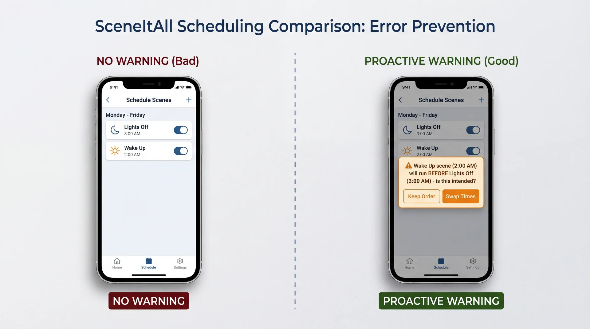
H5: Design to Prevent Errors, Not Just Handle Them
H6: Recognition Over Recall Reduces Memory Burden
Minimize the user's memory load by making objects, actions, and options visible. Users should not have to remember information from one part of the interface to another.
SceneItAll applications:
- Show current device states in scene editor, not just target states
- "Currently: 75%" when setting brightness — user knows starting point
- Display which scenes affect which devices
- Don't make users remember that "Movie Night" controls living room shades
- Show recent choices
- Last-used scenes, recent devices, common operations
Recognition is easier than recall. Seeing "Living Room" is easier than remembering it.
H7: Flexibility Serves Both Novices and Experts
Accelerators — unseen by the novice user — may speed up the interaction for the expert user, allowing the system to cater to both inexperienced and experienced users.
SceneItAll flexibility spectrum:
| User Level | Interaction Style |
|---|---|
| Novice | Tap room → tap device → adjust slider |
| Intermediate | Use scene buttons for common operations |
| Expert | Voice command: "set office lights to 30%" |
| Power user | CLI: sceneitall set office lights 30% |
Connection to earlier: This is the CLI vs. GUI trade-off — the answer is often "both."
H8: Every Extra Element Competes for Attention
Interfaces should not contain information that is irrelevant or rarely needed. Every extra unit of information competes with the relevant information and diminishes their relative visibility.
SceneItAll prioritization:
| Emphasize | De-emphasize |
|---|---|
| On/Off toggle | Firmware version |
| Brightness slider | Network address |
| Color picker | Last-updated timestamp |
| Room name | Device ID |
Minimalist ≠ minimal features. It means every visible element earns its space by serving user goals.
H9: Error Messages Should Explain Problems and Suggest Solutions
Bad Error Message
DeviceConnectionException:
timeout at IoTBridge.sendCommand()
line 247
- Technical jargon
- No explanation of cause
- No path forward
- Makes user feel stupid
Good Error Message
Couldn't reach Kitchen Light

The light isn't responding. Try:
• Check if it's plugged in
• Move closer to reduce distance
• Wait a moment and try again

[Try Again]  [Skip This Device]
- Plain language
- Likely cause explained
- Actionable suggestions
- Clear next steps
H10: Help Should Be Searchable, Task-Focused, and Concise
Even though it is better if the system can be used without documentation, it may be necessary to provide help. Such information should be easy to search, focused on the user's task, list concrete steps, and not be too large.
SceneItAll help patterns:
- Contextual help: "How do I create a scene?" appears on scenes screen
- Task-focused: Steps to accomplish specific goals, not feature descriptions
- Searchable: "How do I..." queries return relevant results
- Not a PDF manual: No 50-page document about IoT protocols
The best help is available where and when users need it.
Key Takeaways: Building Software People Actually Want to Use
-
Five aspects of usability (learnability, effectiveness, productivity, retainability, satisfiability) — and they trade off against each other
-
Personas make trade-off decisions concrete and explicit — "Would Marcus find this useful? Would Dorothy be confused?"
-
Different stakeholders have different priorities (L9 connection) — you can't optimize for everyone
-
Poor usability has safety implications — physical, security, privacy, financial, and operational risks
-
Nielsen's heuristics provide a systematic evaluation framework — a 30-year-old checklist that still works
-
Mental models bridge domain understanding to interface design (L12 connection) — when system matches expectations, it "just works"
Looking Ahead
Next up: Exam Review → Exam
- Today's usability content is not on the exam
- Focus your exam prep on material through last week
After the exam: User-Centered Design (UCD) Process
- How to integrate usability throughout development
- Prototyping techniques (paper, wireframe, interactive)
- Iterative testing and refinement
Later this semester: Safety and Reliability (L35)
- When usability failures cause real harm
- The intersection of usability and safety requirements
Today we learned to evaluate usability. After the exam, we'll learn to design for it from the start.