Lecture overview:
Total time: ~45 minutesPrerequisites: L24 (Usability, heuristic evaluation), L9 (Requirements analysis)Connects to: Lab usability work, final project Structure (~28 slides):
Recall from L24 (~2 min) — quick bridge to usability concepts from last week
Arc 1: Why UCD Matters (~12 min) — limitations of expert review, cost of building wrong thing, can't think your way to usability
Arc 2: The UCD Process (~6 min) — iterative cycle, fidelity matching
Arc 3: Prototyping Approaches (~10 min) — paper, Wizard-of-Oz, working prototypes, AI as accelerator
Arc 4: Evaluation Methods (~10 min) — think-aloud, facilitation tips, task completion, root cause analysis, iteration guidance
Arc 5: UCD as Requirements Discovery (~8 min) — interviews vs prototypes, requirements from prototypes, findings→requirements, risk reduction
Design Sprints (~3 min) — GA0 connection, time-boxed UCD in practice
Key Takeaways (~2 min)
Running example: Study room booking app
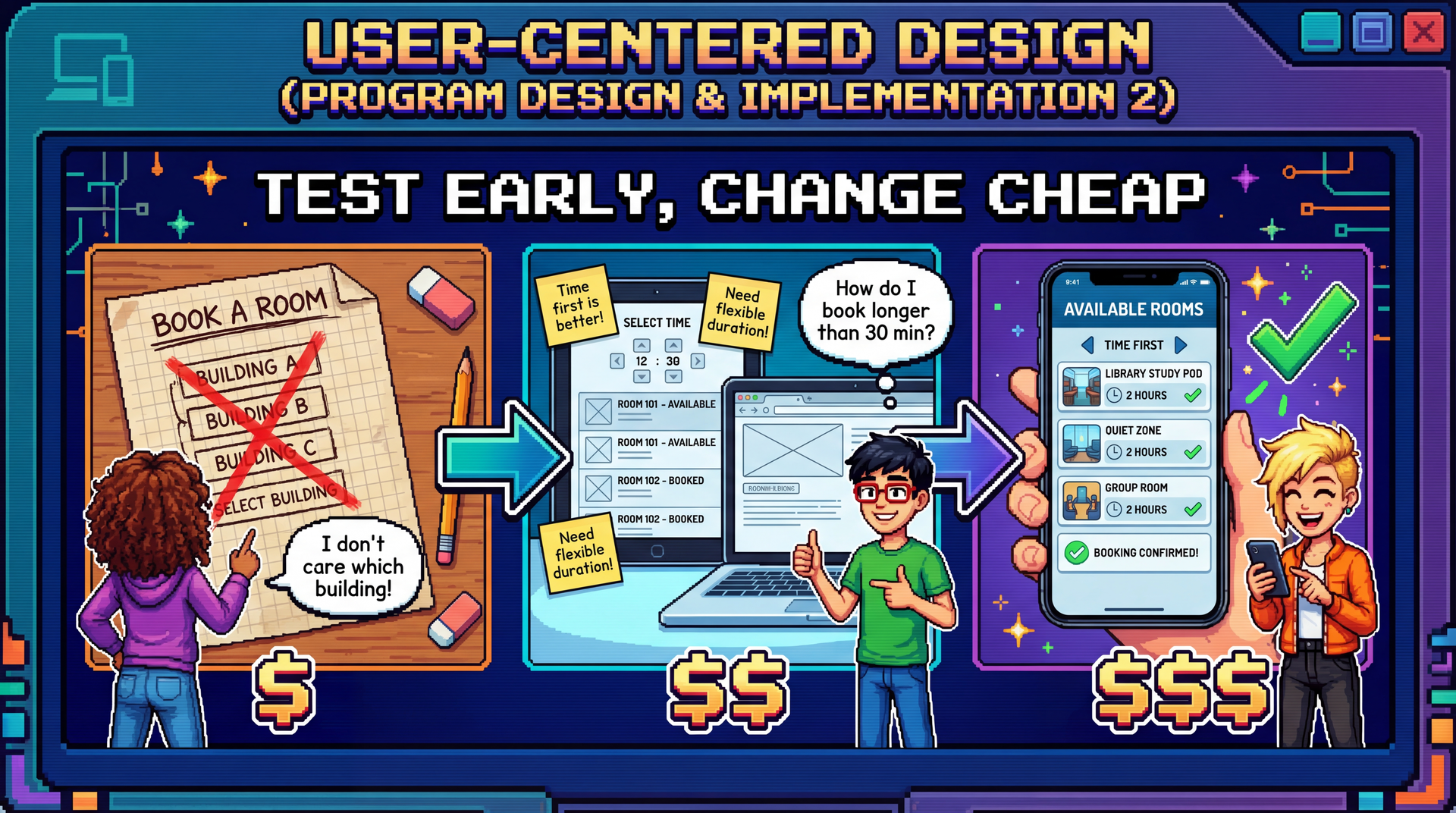
Cover image concept: The image shows the evolution of the study room booking app through three UCD stages — paper sketch with user feedback ("I don't care which building!"), wireframe mockup with more feedback, and polished final app. Each stage shows real users providing input and the design improving. The cost labels ($, $$, $$$) reinforce that early changes are cheap.
Narrative spine: In L24, we learned to evaluate usability with heuristics. But expert evaluation misses real user confusion. UCD closes that gap by putting real users at the center of the design process — through prototyping and evaluation at every stage, not just at the end.
Transition: Let's start with the learning objectives...
CS 3100: Program Design and Implementation II Lecture 27: User-Centered Design
©2026 Jonathan Bell, CC-BY-SA
Context from previous lectures:
L9: Requirements analysis — participatory vs. extractive approaches
L24: Usability — five aspects, personas, mental models, Nielsen's heuristics
Today: How do we design for usability from the start, rather than just evaluate at the end?
Key theme: Expert evaluation finds obvious violations. Only real users reveal the invisible gap between your mental model and theirs.
Transition: Here's what you'll be able to do after today...
Learning Objectives
After this lecture, you will be able to:
Describe the value of user-centered design in software development Describe the UCD process: prototyping and evaluation for usability Apply UCD as a requirements elicitation technique Time allocation:
Objective 1: Why UCD matters, cost of skipping it (~12 min)
Objective 2: UCD cycle, prototyping approaches, evaluation methods (~24 min)
Objective 3: UCD as requirements discovery, risk reduction (~7 min)
Connection to L24: We learned what usability is and how to evaluate it with heuristics. Today we learn how to design for it — and why that process reveals far more than usability issues alone.
Transition: Let's start with a fundamental limitation of what we learned last time...
Recall from L24: What Usability Means Five aspects that trade off against each other
Key concepts from L24:
Marcus & Dorothy — power user vs. occasional user personas with conflicting needsMental models — users and designers think about the same interface differentlyNielsen's 10 Heuristics — systematic expert evaluation checklistStakeholder trade-offs — you can't optimize for everyone
L24 taught us to evaluate usability. Today: how to design for it from the start.
Quick recap (~2 min):
This slide bridges L24 (a week ago, before the exam) to today's content. Students should recognize all these concepts.
Five aspects: Learnability, Effectiveness, Productivity, Retainability, Satisfiability — and the trade-offs between them. Optimizing for one can hurt another.
Marcus & Dorothy: Our personas from SceneItAll. Marcus (power user, wants productivity and flexibility) vs. Dorothy (visiting grandparent, wants learnability and simplicity). Their needs often conflict.
Mental models: The Marcus/Dorothy hierarchy example — when users tap "All Lights Off" on Living Room, different users expect different things (only Living Room? cascade up to Downstairs? cascade down to Reading Nook?).
Nielsen's heuristics: H1-H10, the systematic checklist for expert evaluation. Today we'll see why this isn't enough on its own.
Transition: Let's start with a fundamental limitation of heuristic evaluation...
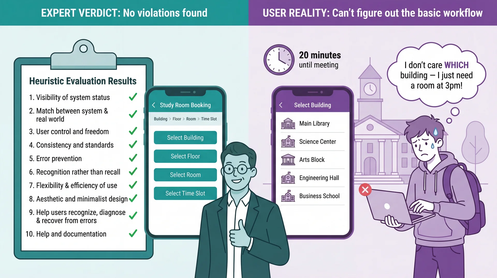
Heuristic Evaluation Catches Violations, Not Misunderstandings
Connection to L24: Heuristic evaluation is valuable — but experts evaluating against principles are not the same as real users trying to accomplish real goals. Use both: heuristics catch obvious violations quickly and cheaply; UCD catches deeper mental model mismatches that experts can't see.
The limitation of heuristic evaluation:
In L24, we learned Nielsen's 10 heuristics — a powerful expert review tool
Experts can catch obvious violations: bad error messages, inconsistent terminology, missing feedback
But heuristic evaluation can't catch problems that emerge from the gap between the designer's mental model and the user's mental model
Study room booking example:
An expert reviews the booking flow and finds no violations
Navigation is consistent (Building > Floor > Room breadcrumbs), labels are clear, available/unavailable indicators provide feedback
But a student rushing to find a room for their 3pm group meeting doesn't think in terms of buildings and floors — they think "I need a room at 3pm, show me what's available"
The insight: The interface is technically flawless. The problem is invisible to experts because the organizational model makes perfect sense to someone who understands the system .
Transition: Why does this happen? Because designers and users think differently...
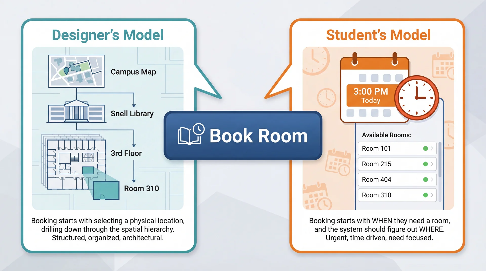
The Designer's Mental Model Is Not the User's Mental Model
Neither model is wrong . But when the interface assumes the designer's model, users who think differently get lost — and no amount of expert review catches this .
Connection to L24: Remember Marcus and Dorothy? Marcus (power user) might think building-first because he understands system architecture. Dorothy (visiting grandparent) thinks time-first — she just wants a room at 3pm. Same gap: expert vs. casual user mental models.
Why mental model gaps are invisible to experts:
Experts share the designer's mental model (they understand the system's structure)
Real users bring their own context: a group meeting in 20 minutes, no preference about which building
The gap isn't a "violation" of any heuristic — it's a mismatch in organizing principles
Why both models are reasonable:
Location-first makes sense if you're the facilities team — rooms ARE physical spaces in buildings
Time-first makes sense if you're a student — you have a TIME constraint, not a LOCATION preference
The designer's model mirrors the system's data model; the user's model mirrors their actual need
Connection to L24 (Mental Models slide):
We saw Marcus and Dorothy having different mental models about SceneItAll's hierarchy
Same principle here: designer and user have fundamentally different starting assumptions
The interface can be perfectly consistent, well-labeled, and error-free — and still confusing
Connection to L9 (Participatory approach):
In L9, we contrasted extractive ("What features do you need?") with participatory ("Show me how you find a room today")
The extractive approach would miss this gap entirely
Only watching students frantically searching for rooms before class reveals it
Transition: So what happens when we skip this step and just build?
Building the Wrong Thing Is the Most Expensive Mistake in Software Paper prototype fix: minutes $
Redesign after shipping: weeks $$$$
Users abandon your product: everything $$$$$
Every team that skipped user feedback and built for 6 months has the same story: "We thought we knew what users wanted."
UCD Activity Tests Which L24 Aspect Paper prototyping Learnability — can users figure it out?Think-aloud testing Effectiveness — can they complete tasks?Iteration with users Satisfiability — do they enjoy using it?Testing after time gap Retainability — can they remember how?
The iceberg of cost:
Fixing a paper sketch: erase and redraw (literally free)
Fixing a mockup: update a Figma file (hours)
Fixing implemented code: refactor, retest, redeploy (days)
Redesigning after shipping: all the above plus migration, retraining, PR damage (weeks)
Users abandoning: no amount of money fixes lost trust
Real-world example:
Team builds entire study room booking system around building-first navigation
After 3 months of development, students say "Why can't I just pick a time?"
Now they need: time-first search, availability aggregation across buildings, "nearest available" logic — none of which was planned
3 months of location-first UI work partially wasted, timeline blown
The ROI math:
Testing 3 paper concepts with 5 students: ~2 hours total
Testing 3 coded concepts with 5 students: ~3 weeks total
Same learning, 100x the cost
UCD doesn't slow you down — it prevents the rework that actually slows you down
The key insight: The later you discover you built the wrong thing, the more expensive it is to fix. UCD front-loads this discovery to when changes are cheap.
Transition: But maybe we're smart enough to get it right without testing?
You Can't Think Your Way to Good Usability What teams assume
"We're smart engineers"
"We use the domain ourselves"
"We read the requirements carefully"
"We applied all 10 heuristics"
"We'll get it right"
What actually happens
Designer assumed building-first navigation → Students wanted time-first search
Designer assumed students know which buildings have whiteboards → Students had no idea
Designer assumed "Reserve" was self-explanatory → Students searched for "Book" or "Get a room" (H2 violation: terminology doesn't match user language)
Designer assumed 30-minute fixed slots → Students wanted custom time ranges like "3pm to 4:30pm" (H1 violation: system constraints not visible)
These aren't edge cases. These are the primary workflow. Connection to L24: Experts applying Nielsen's heuristics are still experts — they share the designer's mental model. Heuristic evaluation catches violations; only real users reveal misunderstandings.
Why smart teams still get it wrong:
Developers have the curse of knowledge — they can't un-know how the system works
Even domain experts (developers who book rooms) aren't representative of all users
Requirements documents describe what the system should do, not how users expect to do it
Heuristic evaluation checks interface quality , not conceptual fit
Each study room booking example:
Navigation: The database is organized by building/floor/room — so the UI mirrors that hierarchy. Students think in time slots, not floor plans.
Room features: The facilities team knows Room 310 has a whiteboard. Students don't — they need to search by feature, not location.
Terminology: "Reserve" is the formal term in the system. Students say "book a room" or "get a room." The button label is technically correct but doesn't match how students talk.
Time slots: 30-minute increments make scheduling logic simple. But study groups don't think in 30-minute blocks — they think "we need about an hour and a half."
The principle: You cannot predict user behavior from first principles. You must observe it.
Transition: So if we can't think our way there, what's the alternative?
Design With Users, Not For Users Extractive (L9)
"What features do you need?"
Requirements document
Build for months
Acceptance test at the end
Participatory (UCD)
"Show me how you find a room today"
Iterate on prototypes together
Feedback at every stage
Users are design partners
Connection to L9: We introduced the participatory approach for requirements. UCD extends it into the entire design and development process.
The Timing Paradox: We Need Feedback Early but Evidence Comes Late Cost to change:
Quality of user evidence:
← Early (design phase) Late (production) →
UCD's answer: iterate with prototypes of increasing fidelity — get user feedback when changes are still cheap.
UCD Is an Iterative Cycle, Not a One-Time Consultation
Each iteration increases fidelity — from paper sketches to working software. Users aren't consulted once at the beginning and again at the end. They're involved continuously .
The four steps:
1. Understand: Who are the users? What are their goals? What's their context?
Builds on stakeholder analysis from L24
Study room app: commuter students, residents, grad students with lab access — different needs and schedules
2. Design: Based on understanding, create a design that addresses user needs
Early: conceptual ("user picks a building, then a floor, then a room")
Later: specific interface layouts and interaction flows
3. Prototype: Build a representation that users can interact with
Doesn't need to be working software
Paper sketches can be "interactive" if a facilitator simulates responses
4. Evaluate: Put the prototype in front of real users, observe what happens
Where do they struggle? What surprises them?
What do they try to do that the design doesn't support?
Then repeat: Incorporate findings into the next iteration
Maybe go back to understanding (discovered a new user type)
Or refine the design based on specific feedback
Each cycle increases confidence
Transition: The key is matching prototype fidelity to your stage...
Prototype Fidelity Should Match Your Current Level of Uncertainty Paper sketches Low fidelity Minutes to create Zero cost to change
Interactive mockups Medium fidelity Hours to create Low cost to change
Working prototypes High fidelity Days to create Medium cost to change
Production software Full fidelity Weeks/months to create High cost to change
High uncertainty? Use low-fidelity prototypes — don't invest in details until the concept is right. Concept validated? Increase fidelity to test interaction details.
The matching principle:
If you're still unsure about the basic concept (should navigation be building-first or time-first?), use paper
If the concept is validated but you're unsure about layout and flow , use interactive mockups
If the flow works but you need to test feel and performance , use working prototypes
Don't build production code to test a hypothesis you could test with paper
Study room example progression:
Paper: "Should booking start from building list, time picker, or campus map?" — test 3 sketches
Mockup: "Students prefer time-first. Now: does the available rooms list make sense?" — clickable Figma
Working prototype: "Room list works. But does the time picker feel right on mobile?" — real code
Production: "Everything works. Ship it."
The cost math:
Testing 3 paper concepts: 30 minutes total
Testing 3 coded concepts: 3 weeks total
Same learning, 100x the cost
Transition: Let's look at each prototyping approach in detail...
Paper Prototypes: Minutes to Create, Zero Cost to Throw Away How it works: Draw each screen on paper. A facilitator "plays computer" — when the user "taps" a button, swap in the next paper screen.
Why it works: Users feel comfortable criticizing paper. Fast to modify during the session. Forces focus on concepts, not visual polish.
Paper prototyping mechanics:
Draw each screen on a separate piece of paper
Lay out the flow: Building List → Floor → Room → Time Slot → Confirmation
Give the user a task: "You have a group project meeting at 3pm. Book a study room."
When user "taps" a button, the facilitator swaps in the appropriate next screen
The facilitator can simulate any system behavior — including behaviors not yet designed
Why paper is perfect for this stage:
The team has a design hypothesis: building-first navigation
Before writing a single line of code, they can test whether this concept works
Drawing 5 screens takes 15 minutes — implementing them takes days
If the concept is wrong (spoiler: it is), nothing is wasted
Advantages:
Extremely fast to create (minutes, not hours)
Easy to modify during the session : "What if we started with time instead of building?"
Users feel comfortable criticizing paper — "This is just a sketch"
No code, no tools, no technical skill required
Limitations:
Can't test detailed interactions (drag-and-drop feel, animation timing)
Facilitator responses may not match what software would actually do
Some users have trouble imagining paper as real software
Transition: Let's see what happens when a student actually uses these paper screens...
Paper Prototypes Reveal Conceptual Confusion Before You Write Code Facilitator (shows paper Screen 1: building list) : "You have a group meeting at 3pm today. Book a study room."
Student : "Um... which building should I pick? I don't care which building. Is there a way to just see what's free at 3?"
Facilitator : "What would you expect to see first?"
Student : "A time picker? Or just... a list of rooms that are available at 3. I don't want to check every building one by one."
The entire navigation concept is wrong — discovered in 5 minutes with paper. Not in 5 sprints with code.
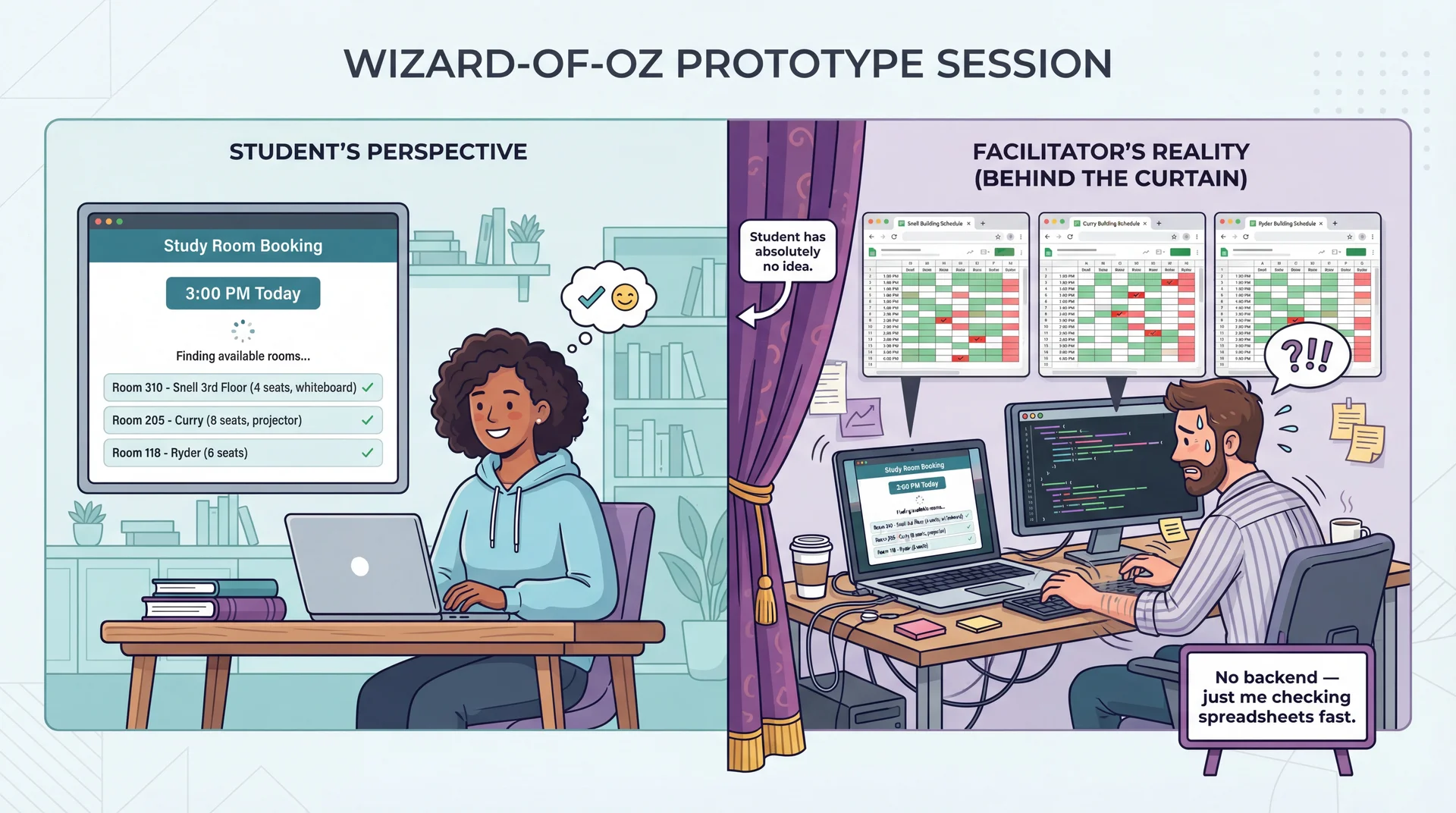
Wizard-of-Oz Prototypes: Real Interface, Human Behind the Curtain
The interface looks real. The responses look real. But a human is simulating the hard parts. Test the user experience before building the technology.
Wizard-of-Oz mechanics:
The user sees what appears to be a working app (could be a clickable mockup, slide deck, or real UI shell)
Instead of actual code processing inputs, a hidden "wizard" observes and triggers appropriate responses
Named after the movie — "pay no attention to the man behind the curtain"
Study room booking example:
Paper prototyping revealed that time-first is the right concept
Now we need to test the redesigned time-first interface with more realism
But building real-time availability aggregation across all campus buildings is complex backend work
Instead: student selects a time → facilitator checks spreadsheets and types available rooms → student sees results
The user experience is identical — the technology behind it doesn't matter yet
What we learn with realistic interfaces:
Students behave more naturally than with paper
We can test whether the room details shown (capacity, amenities) are useful
"Finding available rooms..." — does the student feel confident? Anxious? How long is too long?
Do students understand what "4 seats" means for their group of 5?
When to use:
Concept is validated (paper prototyping done — we know time-first works)
Need to test specific interaction details in the corrected design
The "hard part" (real-time availability backend) isn't built yet but the UX needs testing
Transition: Eventually, some things can only be tested with real code...
Working Prototypes Reveal What Only Real Interaction Can Time Picker Feel
Does the time selector feel snappy on mobile?
Can students quickly jump between days?
Paper and mockups can't test this.
Availability Updates
Does the room list update smoothly when the time changes?
Is the loading state clear?
This is about milliseconds and feedback.
Keyboard Navigation
Can students tab through the time picker and room list?
Do screen readers announce availability?
Accessibility requires real code.
How it works: The UI is fully implemented and responsive. But instead of a real availability API, it returns predefined room lists. Instead of a real booking backend, it uses mock data.
The UI is real. The backend can be mocked. Test the interaction, not the infrastructure.
When you need working prototypes:
After paper and Wizard-of-Oz have validated the concept and flow
When the questions are about feel , not function
Scroll jank, animation timing, touch target sizes, keyboard accessibility
These can only be tested with real code running on real devices
Study room working prototype:
Real app that opens, shows a time picker, displays room results
Selecting any time returns the same predefined list of available rooms
Booking confirmation works fully — you see room details, confirm, get a summary
But there's no real backend — everything is local mock data
What this reveals:
Performance issues: Does the room list load fast enough on a phone between classes?
Interaction details: Is the time picker easy to use with one thumb on a phone?
Accessibility: Does VoiceOver announce room availability clearly?
Edge cases: What happens when no rooms are available?
Cost/benefit:
More expensive than paper or Wizard-of-Oz (days, not minutes/hours)
But still much cheaper than production code (no real backend, no deployment)
Reveals the final class of issues before committing to production
Transition: AI can help speed up prototype creation...
AI Accelerates Prototype Creation, Not User Understanding What AI can do ✓
Generate UI code quickly: "Create a room booking interface with a time picker and room list"
Create realistic sample data: "Generate 50 study rooms across 5 buildings with capacities and amenities"
Produce design variations: "Show me three different layouts for the available rooms list"
Write Wizard-of-Oz scripts: "Write a server that returns mock room availability data"
What AI cannot do ✗
Replace actual user testing: AI generates prototypes, but can't tell you if students understand them
Know your specific users: AI produces "average" designs — your users (commuters? residents? grad students with lab access?) have specific needs
Predict user confusion: The whole point of UCD is that you can't predict user behavior from first principles
AI builds prototypes in seconds. Only users can tell you if they work.
AI as prototype accelerator:
The bottleneck in UCD is not building prototypes — it's getting user feedback
AI dramatically reduces the time to create testable artifacts
"Generate an HTML/CSS mockup of a room booking interface with time picker" → minutes instead of hours
This means more iterations in less time
What AI is great for:
Generating initial UI layouts to react to (not to ship)
Creating realistic dummy data so prototypes feel real
Producing multiple design alternatives quickly
Writing the Wizard-of-Oz backend scripts
What AI fundamentally can't do:
Tell you whether a real student rushing between classes can book a room on their phone
Know that your users think in time-first, not building-first
Predict that "Reserve" is confusing when students say "book"
Replace the act of watching a real person struggle
The right mental model:
AI is a prototype builder
Users are prototype evaluators
Both are essential; neither replaces the other
Transition: Before we move to evaluation methods, let's check understanding with a quick poll...
Launch PollEverywhere
Please open PollEverywhere and join the poll.
5 scenarios — apply L24 concepts (personas, mental models, heuristics) to UCD situations involving campus dining apps, room booking design, and user testing with prototypes.
Poll placement: Between Arc 3 (Prototyping) and Arc 4 (Evaluation) — students have absorbed motivation, process, and all three prototyping approaches. Creates an engagement break before shifting to evaluation methods.
5 questions (recall to application):
1. Mental model gap (LO1)
Your team designs a campus dining app organized by dining hall location. During testing, students say "I just want to know what's open near me that has pizza." What have you discovered?
A) A heuristic violation — the navigation labels are unclear
B) A mental model gap — designers organized by location, users think by food and proximity
C) A bug — the search feature isn't working
D) That students are using the app incorrectly
Answer: B. Parallels the study room example — the interface is technically correct but organized around the wrong concept.
2. Fidelity matching (LO2)
You're unsure whether your app should organize rooms by building, by time, or by campus map. What's the most cost-effective way to find out?
A) Build a working prototype with all three options and A/B test
B) Conduct a survey asking users which they'd prefer
C) Sketch all three on paper and test with 3-5 users
D) Apply Nielsen's heuristics to each design
Answer: C. High uncertainty about the basic concept = low-fidelity prototype. Don't invest in code to test a hypothesis you can test with paper.
3. Prototyping approach (LO2)
Your team validated that time-first booking is the right concept. Now you want to test whether users understand the room capacity labels and can select a duration — but the availability backend doesn't exist yet. What prototyping approach fits?
A) Paper prototype
B) Wizard-of-Oz prototype
C) Working prototype
D) Heuristic evaluation
Answer: B. Concept is validated (past paper stage), need realistic interaction, but backend isn't built — a human simulates the hard parts behind the curtain.
4. Think-aloud insight (LO2 + LO3)
During a think-aloud session, a student says: "It says 3:00 to 3:30 — we need at least an hour. How do I change that?" What type of finding is this?
A) A visual design issue — the duration picker is too small
B) A terminology issue — the user doesn't understand "time slot"
C) A workflow mismatch — users expect custom durations, not fixed 30-min slots
D) User error — they need to read the instructions more carefully
Answer: C. The system assumes fixed slots; the user assumes free-form duration. This is a discovered requirement, not a UI bug.
5. Interview vs. prototype (LO3)
You interview 5 students and ask "What do you need in a room booking app?" They say: search, booking, and a calendar. You then test a paper prototype with 5 different students and discover they also want recurring bookings, custom durations, and to see where friends booked. Why did the interviews miss these?
A) The interviewees were less knowledgeable than the prototype testers
B) The interview questions were poorly designed
C) Users can't articulate needs they haven't encountered yet — prototypes make abstract needs concrete
D) Interviews are always less reliable than prototypes
Answer: C. This is the core LO3 insight. Interviews capture what users think to mention; prototypes reveal what users actually do when faced with a concrete interface.
Transition: Now let's talk about how we actually learn from users interacting with prototypes...
Think-Aloud Protocol: Hear the User's Mental Model in Real Time "As you use this, please tell me what you're thinking. What are you looking at? What are you trying to do?"
"OK, I need a room at 3pm... I see the time picker, that makes sense..."
"I'll select 3pm today... nice, it's showing me rooms..."
"Room 310, 4 seats... wait, there are 5 of us. Does '4 seats' mean 4 max, or is that just the table? "
"OK I'll pick Room 205, 8 seats, that's safe. Booking... confirmed!"
"Wait, it says 3:00 to 3:30? We need at least an hour. How do I change that? " (H1: system status not visible — user didn't know about fixed slots)
The color coding reveals what to listen for: confidence , hesitation , success , problems discovered . Notice how UCD reveals issues that map back to Nielsen's heuristics — but only real users reveal which heuristics matter most.
Think-aloud protocol mechanics:
Ask users to verbalize their thoughts as they use the prototype
"What are you looking at? What do you expect to happen? Why did you click that?"
Record or take notes on everything they say
The facilitator should prompt gently but not lead: "What are you thinking?" not "Did you see the time picker?"
What this transcript reveals:
"I see the time picker, that makes sense" — the time-first redesign works! (good!)
"'4 seats' — does that mean 4 max?" — capacity labeling is ambiguous (need clearer wording or photos)
"3:00 to 3:30?" — default booking duration doesn't match expectations (H1: visibility of system status)
"How do I change that?" — students need easy duration control, not fixed 30-min slots
Why think-aloud is powerful:
Reveals the user's mental model in real time
You hear expectations ("does 4 seats mean 4 max?") before they become frustrations
You learn what users notice and what they miss
You discover requirements: custom duration is a requirement nobody planned for
Limitations:
Thinking aloud is unnatural — some students clam up
Verbalizing can change behavior (users become more careful)
Small sample sizes (typically 5-8 users per round)
Transition: Here are some practical tips for running these sessions...
Running a User Test: Practical Tips Do
"What are you thinking?"
"What do you expect to happen?"
"Walk me through what you're trying to do"
Wait through silence — let them work it out
Take notes on behavior , not just words
Don't
"Did you see the time picker?" ← leading
"You need to click there" ← helping
"That's not how it works" ← correcting
Explain the design before they try it
Test with only people on your team
A 25-minute session: 5 min warmup ("think aloud as you go") → 15 min tasks (3-4 concrete tasks) → 5 min debrief ("what surprised you?"). 3-5 users catches most major problems.
How to actually run a user test:
Recruiting participants:
You need 3-5 people who are NOT on your team
Classmates, friends, family members — anyone who represents your target user
Don't use 5 CS majors if your users are home cooks
For GA0: your TA mentor is your first evaluator. Classmates outside your team are great for additional testing.
Session structure (25 minutes):
Warmup (5 min): "I'm testing the design, not you. There are no wrong answers. Please think aloud — tell me what you're looking at and what you're trying to do."Tasks (15 min): Give 3-4 concrete tasks. "Book a room for your group at 3pm." Watch what they do. Don't help.Debrief (5 min): "What was hardest? What surprised you? What would you change?" When users go silent:
Wait 5-10 seconds — silence is data (they're confused or concentrating)
Then gently: "What are you thinking right now?"
If still stuck: "What are you trying to do?" — NOT "Try clicking the time picker"
The golden rule: Every time you want to help, bite your tongue. Their struggle IS the data.
How many users?
Nielsen's research: 5 users find ~85% of usability problems
3 users find ~65% — often enough for major issues
Diminishing returns above 8-10
For GA0: even 1-2 people outside your team is dramatically better than 0
Transition: For more quantitative data, we can measure task completion...
Task Completion Testing: Measure Where Users Succeed and Fail Study room booking tasks given to 10 test users:
Find a room with a whiteboard Book for longer than 30 min Success rate
Time on task
Error rate
Assistance needed
Task completion testing mechanics:
Give users specific, concrete tasks (not "explore the app")
Observe whether they can complete them — without helping
Measure success rate, time, errors, and whether they asked for help
What the study room data tells us:
Basic booking works great (90%) — the time-first design is intuitive
Filtering by amenities works pretty well (80%) — most students find the whiteboard filter
Custom duration is mediocre (65%) — students struggle with 30-min slot increments
Cancel/rebook is terrible (30%) — students can't find their existing bookings
What to do with this data (rough thresholds):
>85% success → working fine, ship it — don't fix what isn't broken
70-85% success → minor tweaks needed (label changes, visual hierarchy)
50-70% success → moderate redesign — the concept is right but the interaction is wrong
<50% success → fundamental rethink — users don't understand the concept at all
These are guidelines, not rules — a 60% success rate on a core workflow is worse than 60% on a nice-to-have
How many users?
Nielsen's research: 5 users catch ~85% of usability problems
8-10 users for quantitative data
Diminishing returns above ~15
Transition: But raw success rates don't tell you why users fail...
Findings Require Root Cause Analysis, Not Just Symptom Fixing Finding: "Students can't book for longer than 30 minutes"
Same symptom, three different root causes, three different fixes. Connection to L24: Root causes often map to specific heuristics (H1: visibility, H2: user language) — but UCD reveals which root cause is actually affecting your users.
Why root cause matters:
"Students can't book for more than 30 min" might mean the duration picker is hidden — easy visual fix
Or it might mean students don't realize they can select multiple slots — labeling fix
Or it might mean students expect to type "3pm to 4:30pm" and the fixed-slot model is fundamentally wrong — conceptual model fix
If you pick the wrong root cause, you'll "fix" it and students will still fail
How to determine root cause:
Think-aloud data helps: Did students see the duration option and ignore it? (Labeling problem)
Did students look for a way to extend and not find it? (Visual design problem)
Did students find it, try it, and say "This isn't what I expected"? (Conceptual model problem)
Prioritization framework:
Severity: Does it prevent task completion or just slow users down?Frequency: Does it affect most users or just edge cases?Cost to fix: Quick label change vs. architectural restructure? The validation step:
After implementing changes, test again with new users
Confirm the fix works
Check that it doesn't introduce new problems (changing time selection might break the availability display)
This is another iteration of the UCD cycle
Transition: But how many times do we iterate?
How Many Iterations? It Depends — and That's OK
Move to higher fidelity when major conceptual issues are resolvedIterate at the same fidelity when you're still finding fundamental problemsStop when additional testing reveals only minor, diminishing issues
There's no magic number of iterations. The goal is confidence that the concept is right before investing in higher-fidelity work. CS 2484 and 4530 explore this process in much greater depth.
How many cycles is enough?
There is no universal answer — it depends on risk, timeline, and what you're learning
The honest answer: iterate until you stop being surprised by user behavior
If every test session reveals a fundamental misunderstanding, you're not ready to move up in fidelity
If test sessions mostly confirm what you expected with minor tweaks, you're ready
Practical signals for "move to next fidelity":
Paper → Mockup: Users understand the concept and can complete the basic flow. Remaining issues are about layout, visual hierarchy, and interaction details — not about whether the organizing principle is right.
Mockup → Working prototype: Users can navigate the flow and complete tasks. Remaining issues are about feel — performance, timing, touch targets, accessibility.
Working prototype → Production: Users can accomplish real tasks successfully. Remaining issues are about polish, edge cases, and scale.
Practical signals for "iterate at same fidelity":
Users are stuck on Screen 1 (like our building-first example)
Multiple users try the same wrong path
Users describe a fundamentally different mental model than what you designed
Signals for "stop iterating":
Last 2-3 users had only minor, different issues (no pattern)
Success rate on core tasks is above your threshold (>85%)
You're making changes that affect less than 5% of users
For this course:
In GA0, you'll do 1-2 iterations at most (paper sketches → TA feedback → revised design)
In industry and in CS 4530, you'd do more formal cycles with larger user pools
The principle is what matters: test early, iterate, increase fidelity as confidence grows
CS 4530 connection:
CS 4530 (Software Development) covers the full UCD lifecycle in depth
Includes: formal usability studies, A/B testing, analytics-driven iteration, accessibility audits
Think of today as the conceptual foundation — you now understand why and what ; CS 4530 teaches how at scale
Transition: Now here's the really powerful insight about UCD...
Prototypes Reveal What Interviews Miss Interview (L9 extractive approach)
"What features do you need in a room booking app?"
"Search for rooms"
"Book a room"
"See my bookings"
3 basic features described.
Interviews capture what users think to mention .
Prototype testing (UCD)
Watch a student use a paper prototype to book a room.
"I think about time, not building" ← conceptual model
"I need this room every Tuesday" ← recurring booking
"Does '4 seats' mean max?" ← ambiguous labeling
"Can I extend if we run over?" ← edge case
"Can I see where my friends booked?" ← social feature
5+ requirements and conceptual insights discovered.
Prototypes reveal what users actually do .
Interviews discover features . Prototypes discover requirements — including the organizing principles and workflows that make features usable. Connection to L24: Prototypes test all five usability aspects directly — can users learn it, be effective , stay productive ?
Why interviews miss these:
Users can't articulate needs they haven't imagined yet (L9 participatory insight)
Interviews ask about features ; prototypes reveal workflows
Interviews depend on what users remember to mention ; prototypes reveal what users actually do
Users tell you about their current tools; prototypes reveal what they expect from yours
The study room comparison in detail:
Interview: "I need search" — OK, but search by what? By time? By building? By amenity? The interview doesn't tell you.
Prototype: Student ignores the building list and looks for a time picker — NOW you know the organizing principle.
Interview: Nobody mentions recurring bookings — it doesn't occur to them in the abstract.
Prototype: "I need this room every Tuesday" — it occurs to them because they're actually imagining booking a room .
Connection to L9:
In L9 we said: "Users can't always articulate what they need"
Today we see the solution: don't ask them to articulate — watch them interact
UCD makes the participatory approach from L9 concrete and repeatable
Transition: Let's see more of what prototype testing reveals...
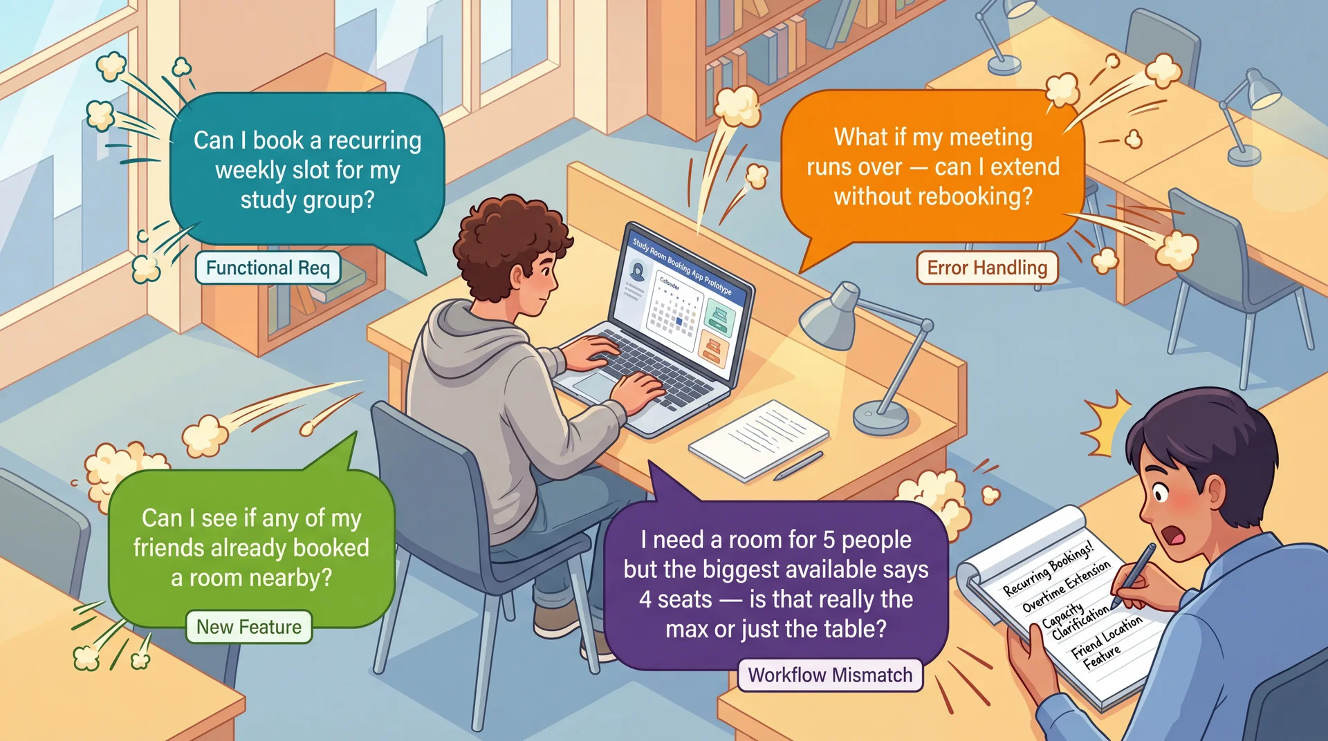
Users Interacting With Prototypes Reveal Requirements You Never Imagined
UCD isn't just a usability technique — it's a requirements elicitation technique . Real users with real tasks reveal functional requirements, edge cases, and workflow mismatches that no requirements document would capture.
The insight that elevates UCD:
When you put real users in front of real (or simulated) interfaces, you discover all kinds of requirements — not just usability concerns
What each discovery type reveals:
Functional requirements ("Can I book a recurring weekly slot?"):
Recurring bookings — a feature nobody planned
Emerged only because the student has a weekly study group
No requirements interview would have surfaced this
Edge cases and error handling ("What if my meeting runs over?"):
Extension handling, grace periods, conflict resolution
What happens when the next slot is already booked?
Only visible when a student imagines their real schedule
Workflow mismatches ("4 seats — is that really the max?"):
Design shows capacity as a number, students interpret it ambiguously
A fundamental mismatch between the data model and user understanding
Maybe rooms need photos, or "fits 4 comfortably, 6 max" labels
New features ("Can I see if my friends booked nearby?"):
Students think of study rooms socially , not just spatially
Coordinating with friends is part of how students actually use rooms
This is domain knowledge that only emerges through observation
Transition: But how do we turn these observations into actual requirements?
Translating Observations Into Requirements After a prototype session, document what you learned:
User said: "We need this room every Tuesday" → Requirement: Recurring weekly booking (Functional)
User did: Ignored building list, looked for time picker → Requirement: Time-first navigation as default (Conceptual model)
User asked: "Does '4 seats' mean max?" → Requirement: Capacity must distinguish comfortable vs. maximum (Labeling)
User struggled: Couldn't extend past 30 min → Requirement: Custom duration input, not fixed slots (Workflow mismatch)
Every observation has a source (what the user said/did), a requirement (what the system needs), and a type (functional, conceptual, labeling, workflow). This is how UCD produces requirements, not just usability feedback.
Why this step matters:
Without documenting findings as requirements, prototype testing is just "we watched some people"
With documentation, it becomes a systematic requirements elicitation process
This is the difference between "we did UCD" and "UCD revealed these specific requirements"
Types of requirements UCD discovers:
Functional: New capabilities the system needs (recurring booking, extensions, social features)Conceptual model: How users think about the domain (time-first vs. building-first)Labeling/terminology: What words users use and expect ("book" not "reserve," capacity clarification)Workflow: How users expect to accomplish tasks (custom duration, not fixed slots)Edge cases: What happens when things go wrong (meeting runs over, no rooms available) For GA0:
When you show your wireframes to your TA or a classmate, write down what they say and do
Translate each observation into a requirement using this format
This is how your design sprint becomes a requirements discovery exercise, not just a design exercise
Prioritizing discovered requirements:
Frequency: Did 1 user mention it or 3 out of 5? If multiple users hit the same issue, it's a real requirement.Severity: Does it block the core task or just slow them down?Cost: Quick label change or architectural restructure?Use these three dimensions to decide what to address in GA1 vs. defer to GA2
Transition: This discovery process directly reduces the requirements risks from L9...
UCD Reduces All Three Dimensions of Requirements Risk Understanding Risk ↓
Instead of interpreting requirements documents, you watch users interpret your interface .
Having a representative set of users test your prototype directly reduces this risk.
Scope Risk ↓
Prototyping reveals hidden complexity. The "simple" room booking turns out to need recurring slots, duration control, capacity clarification, and social features.
Better to discover this expansion during paper prototyping than during implementation .
Volatility Risk ↓
Early user feedback lets you pivot before committing.
If prototype testing reveals students fundamentally misunderstand your booking workflow, you can redesign the concept before building it.
Connection to L9: Same three risk dimensions we identified in requirements analysis — now with a concrete mitigation strategy at every stage of development.
Recall from L9 — three dimensions of requirements risk:
Understanding risk: Do we understand what users actually need?Scope risk: Do we know how big this really is?Volatility risk: Will requirements change under us? How UCD addresses each:
Understanding risk:
Instead of reading requirements and guessing what they mean
You watch real students interact with your design
Their behavior is the requirement — no interpretation needed
"Students think time-first, not building-first" is clearer than any requirements doc
Scope risk:
Every prototype session reveals new requirements nobody anticipated
Recurring bookings, duration control, capacity clarification, social features
Finding these during paper prototyping = adjust plan
Finding these during implementation = scope explosion and timeline slip
Volatility risk:
Early feedback means early pivots — when pivoting is cheap
"Students don't understand the building-first navigation" → redesign on paper (hours)
vs. discovering this after implementation → rewrite code (weeks)
The meta-point:
UCD creates a continuous feedback loop between users, requirements, and implementation
The result isn't just more usable software — it's software that more accurately solves the real problem
Transition: Let's make this cost comparison concrete...
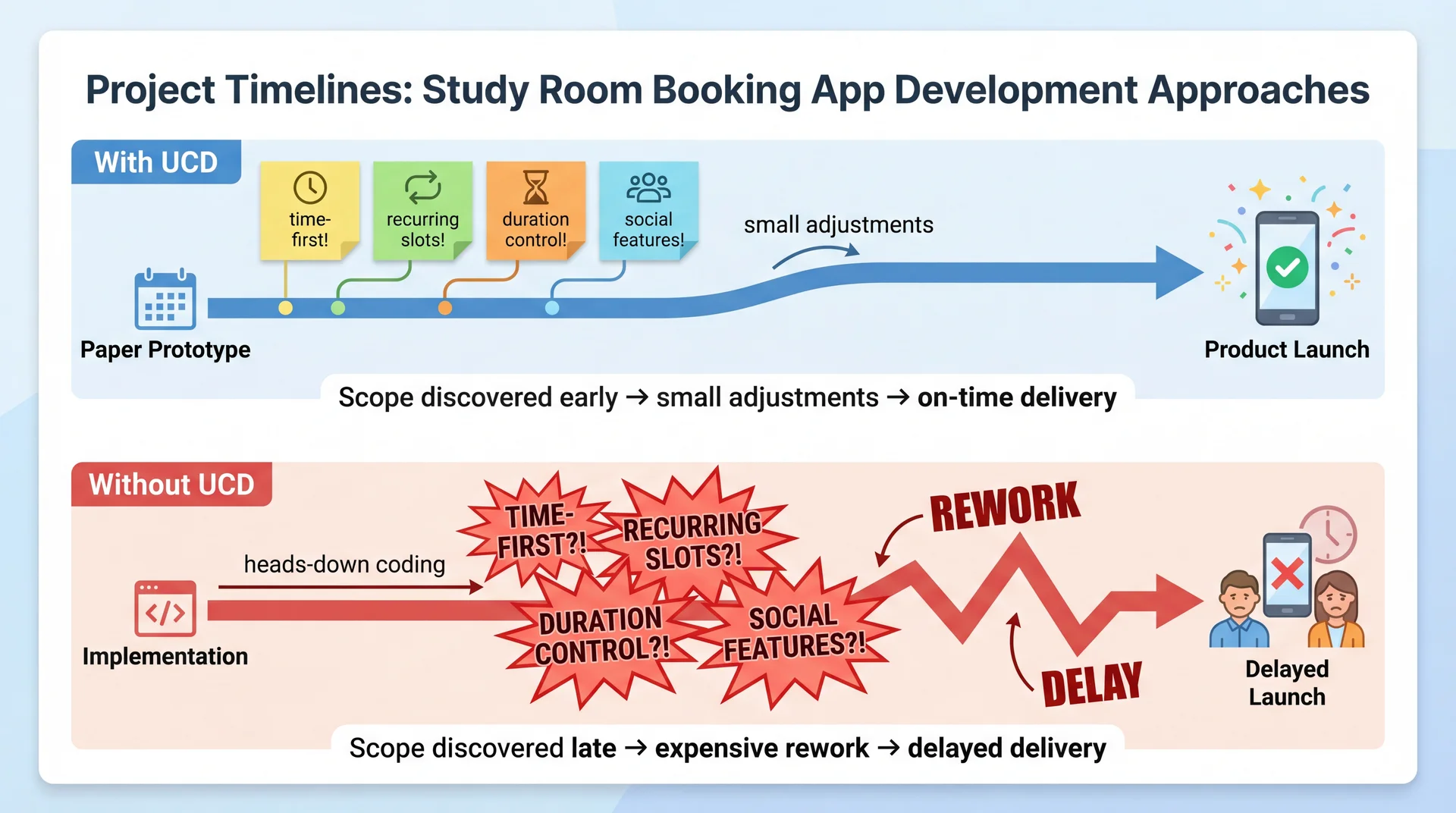
Better to Discover Hidden Scope on Paper Than in Production The visual tells the story:
With UCD:
Paper prototype phase: discover time-first preference, recurring booking need, duration control, social features
Each discovery is a small sticky note — manageable, expected
The team adjusts their plan early — while it's still cheap
Delivery stays on track because scope was understood before building began
Without UCD:
The team charges ahead, coding the building-first navigation as designed
3 months in: beta users say "Why can't I just pick a time?"
3.5 months in: students say "I need this room every Tuesday"
4 months in: "Why can't I book for more than 30 minutes?"
Each discovery is an explosion — rework, refactoring, timeline slip
The math:
Both teams discover the same requirements
Team 1 discovers them on paper (cost: hours of prototype iteration)
Team 2 discovers them in code (cost: weeks of rework)
Same knowledge, 10-100x difference in cost
The takeaway for students:
Before your next project, spend an hour with paper prototypes and a real user
You'll learn more about what to build than a week of requirements analysis
UCD isn't extra work — it's work that prevents far more work later
Transition: Let's wrap up...
Your Design Sprint: GA0 Starts Today A design sprint is a time-boxed period where a team applies UCD before writing production code . Here's yours:
Each team member (15 pts)
User Persona — a realistic user of your feature (goals, pain points, context)Low-fidelity wireframes — 3-5 hand-drawn screens showing key interactionsAccessibility considerations — keyboard nav, screen readers, WCAG As a team (15 pts)
Architecture diagram — ViewModels ↔ ServicesIntegrated wireframes — navigation flow between featuresUI terminology table — consistent user-facing labelsFeature Buffet selection — pick 2-3 for GA2"Our Feature" concept — your original idea (designed, not built)
Due Thursday March 26. Full spec: GA0: Design Sprint . Assign features, then start sketching.
Walk through GA0 with students:
Step 1 — Assign features today. Each team member owns one core feature:
Library View, Recipe Editor, Import Interface, Search & Filter (3-person teams can drop Search)
Update your Team Charter with assignments
Step 2 — Individual deliverables. Each person creates for their feature:
User Persona: Think about who uses your feature. A home cook importing grandmother's recipes is different from a food blogger organizing content. Be specific — name, background, goals, pain points, context.Wireframes: Hand-drawn is fine — photos of whiteboard sketches are acceptable. Show 3-5 screens: main view, key interactions, transitions to other features. These ARE the paper prototypes we just talked about.Accessibility: How does your feature work with a keyboard only? What does a screen reader announce? How do you handle color/contrast? Step 3 — Team deliverables. Come together to:
Architecture diagram: How do your ViewModels connect to the A5 services?Integrated wireframes: How does a user navigate between your features?Terminology table: This is EXACTLY the mental model alignment we discussed — is it "Cookbook" or "Collection"? "Import" or "Add Recipe"?Feature Buffet: Pick 2-3 features for GA2. Graded on process not product, so pick what interests you."Our Feature": Design something creative that ISN'T on the buffet. Full UCD creativity, no implementation constraint. TA mentor meetings — your first user test:
You have your weekly 30-minute meeting with your TA mentor early next week
Come prepared with your feature assignments and initial wireframe sketches
Treat this as a prototype evaluation session: Show your TA your wireframes and ask them to walk through a task. Listen for confusion, unexpected questions, and assumptions that don't match yours.Don't wait until Wednesday night to start — your TA meeting is your first real "user feedback" opportunity
GA0 is a requirements discovery exercise, not just a design exercise:
Your wireframes ARE paper prototypes — testing them reveals requirements you didn't anticipate
Your terminology table IS requirements elicitation — it documents the conceptual model your users actually employ
Your "Our Feature" IS UCD as a creative, generative technique — start with user pain points, not technical possibilities
After testing your wireframes, ask yourself: "Did anyone react in a way I didn't expect? Did anyone want to do something my design doesn't support?" Those are discovered requirements.Bring at least 2 "requirements we didn't anticipate" findings to your team meeting
Transition: Let's wrap up with the key takeaways...
Key Takeaways: UCD Creates a Continuous Feedback Loop Between Users and Implementation
Expert evaluation has limits — heuristic evaluation catches violations, but only real users reveal the gap between your mental model and theirs
Building the wrong thing is the most expensive mistake — 2 hours of paper prototyping can save weeks of rework
Iterate with increasing fidelity — paper → mockups → working prototypes, testing with users at each stage. Move up when the concept is validated.
Prototypes reveal what interviews miss — interviews discover features; prototypes discover requirements, mental models, and workflows
Document findings as requirements — every observation has a source (what the user said/did), a requirement (what the system needs), and a type (functional, conceptual, labeling, workflow)
UCD reduces understanding, scope, and volatility risk (L9) — by making requirements visible through user behavior, not documents
The meta-message:
In L24, we learned to evaluate usability (heuristics, personas)
Today we learned to design for usability (UCD process)
The key insight: UCD isn't just about making things pretty or easy to use
It's about building the right thing — and discovering what "right" means through observation
For their projects:
Even a single paper prototype session with one real user will teach you something you didn't know
The cost is minutes; the savings can be weeks
Don't wait until the end to get user feedback — by then, it's too late to change anything fundamental
Connection across the course:
L9: Requirements analysis (participatory approach)
L12: Domain modeling (user vocabulary)
L24: Usability evaluation (heuristics, personas)
Today: UCD process (prototyping, iterative evaluation)
These all form a coherent approach to building software that serves real human needs
Transition: Looking ahead...
Looking Ahead Today: Assign features to team members, start sketching wireframes
Early next week: TA mentor meeting — bring your feature assignments and initial sketches for feedback
Thursday March 26: GA0 Design Sprint due
Next lecture: Accessibility and Inclusivity — designing for the full range of human ability
Today we learned to design with users. Next, we'll ask: which users — and are we designing for all of them?
Action items for students — make this concrete:
Today after class: Coordinate with your team. Assign features (Library View, Recipe Editor, Import Interface, Search & Filter). Update your Team Charter.This weekend: Start your individual deliverables — persona and wireframes for your feature. Hand-drawn is fine. Don't overthink it.Early next week: TA mentor meeting. Bring your wireframe sketches and persona drafts. This is your first real "user feedback" opportunity — your TA can react to your designs the way a user would. Don't show up empty-handed.Midweek: Team deliverables — architecture diagram, integrated wireframes, terminology table, feature buffet selection, "Our Feature" concept.Thursday March 26: Everything due. Preview of accessibility lecture:
UCD assumes we know who our users are
But who gets to be a user? Who gets excluded?
Accessibility means designing for the full range of human ability — vision, motor, cognitive, situational
Connection: UCD's participatory approach only works if your participants represent your actual users
GA0 includes accessibility considerations — next lecture gives you the tools to do that well
That's it for today. Questions?